Cogimator – A Curated Directory of Unique Websites#
Cogimator.net is a carefully curated directory of websites that offer something more than just sleek design or trending buzz. It’s a collection of digital places created with passion — independent projects, experiments, and archives that challenge how we experience the web.
We don’t chase popularity. Instead, Cogimator focuses on originality, usefulness, creativity, and cognitive depth. You’ll find websites that are often overlooked by mainstream platforms — projects made by individuals, small teams, or devoted communities.
In short, it’s a curated directory of unique websites — assembled by hand, driven by curiosity.
We feature:
educational tools and visual simulations
cultural curiosities and digital micro-archives
experimental interfaces and interactive essays
artistic expressions and personal knowledge libraries
web-native projects that defy classification
Our mission is to:
support independent creators and timeless ideas
promote alternative knowledge sources
encourage slow exploration and digital curiosity
Most featured sites are:
non-commercial or ad-free
niche but high quality
thoughtfully crafted and often hand-coded
alive for years, yet virtually invisible to the average user
We believe in an internet that surprises, teaches, and inspires — a web that resists homogenization. If you’re tired of algorithms, top-10 lists, and over-optimized content, you’re in the right place.
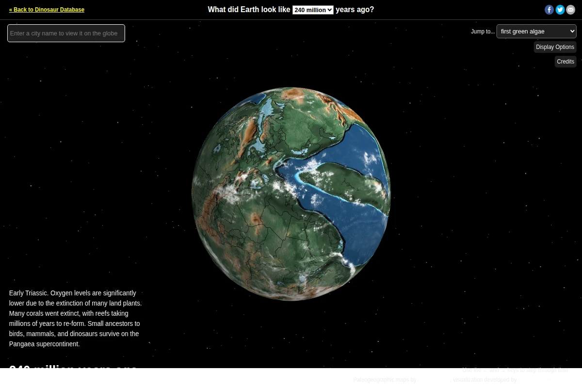
There is something quietly staggering about typing the name of your city and watching it appear on the surface of Pangaea. That is exactly what Ancient Earth Globe offers — a beautifully rendered, interactive 3D visualization of our planet’s deep history, from the first green algae 750 million years ago all the way to the present day. Built by Ian Webster using paleogeographic maps by C.R. Scotese, the tool translates rigorous scientific data into something anyone can spin, zoom, and explore with a mouse.\n\nThe interface is deliberately uncluttered. A dropdown lets you snap to specific geological and biological milestones — first coral reefs, first dinosaurs, first flowers, the Cretaceous, the dinosaur extinction — while arrow keys allow you to step through time in measured increments. Each epoch comes with a concise contextual note: the Early Triassic view at 240 million years ago, for instance, quietly explains that oxygen levels had plummeted after mass extinction wiped out vast swaths of plant life, while the surviving ancestors of birds, mammals, and dinosaurs clung to the vast Pangaea supercontinent.\n\nWhat elevates this beyond a novelty is its scientific grounding. The paleogeographic reconstructions are drawn from decades of geological research, giving the drifting continents a credibility that purely illustrative maps often lack. Watching the familiar silhouettes of today’s landmasses slowly dissolve — Africa and South America peeling apart, the Tethys Sea opening and closing like a slow breath — makes deep time feel viscerally real in a way that a textbook rarely achieves.\n\nThe site lives as a companion to the Dinosaur Database at dinosaurpictures.org, but it stands entirely on its own merits as a tool for curiosity-driven exploration. Whether you are a student, a teacher, or simply someone who has ever wondered what the ground beneath your feet looked like when the first fish hauled itself onto land, this is an exceptional place to spend an hour getting pleasantly lost in geological time.\n\n🔗 dinosaurpictures.org
...
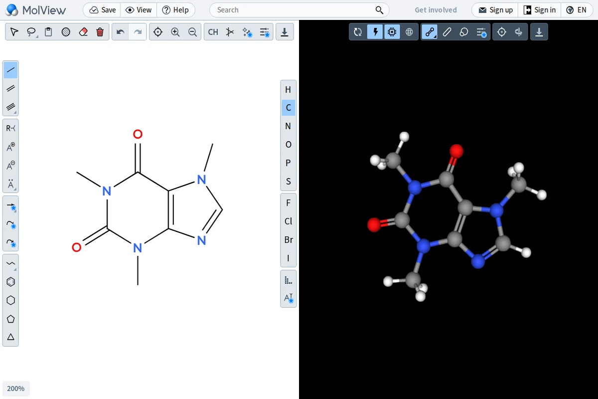
MolView occupies a rare sweet spot: it’s simple enough for a high school student exploring caffeine’s structure for the first time, yet capable enough to satisfy a researcher who needs a quick 3D conformation check. The interface is split cleanly down the middle — a 2D structural editor on the left and a live, rotatable 3D model on the right. Every change you sketch instantly propagates into the three-dimensional view, making the relationship between flat chemical notation and spatial molecular geometry viscerally tangible.\n\nThe 2D editor offers all the building blocks a chemist could want — single, double, and triple bonds, a full suite of ring templates from benzene to cyclopentane, and a periodic table sidebar covering the most common elements (H, C, N, O, P, S, F, Cl, Br, I). The 3D viewport renders molecules using a clean ball-and-stick model against a stark black background, with color-coded atoms following standard CPK conventions. Multiple rendering modes are available, including wireframe and space-filling styles, and the model can be exported for further use.\n\nWhat sets MolView apart from heavyweight desktop applications like Avogadro or ChemDraw is its radical accessibility. There’s nothing to install, no license to purchase, and the tool works across devices. It supports searching by compound name or CAS number, pulling in known structures from public chemical databases — so typing “aspirin” or “dopamine” immediately gives you a publication-ready diagram. This makes it an exceptional teaching tool as much as a practical one.\n\nFor anyone curious about the molecular world — educators, students, science communicators, or simply the chemically curious — MolView offers a genuinely delightful entry point. It turns abstract structural formulas into something you can grab and rotate, collapsing the distance between a textbook page and a molecule’s true three-dimensional soul.\n\n🔗 app.molview.com
...
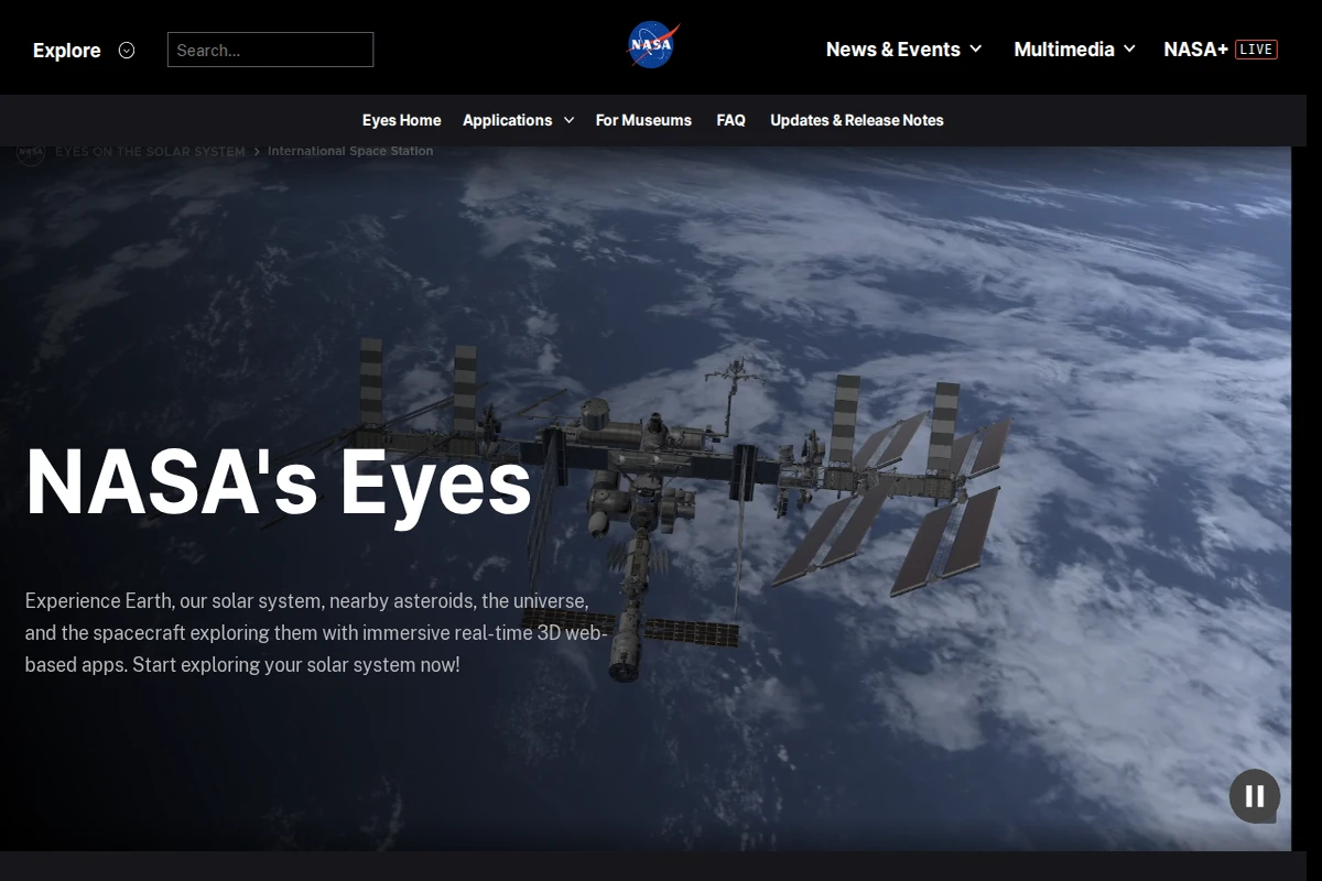
NASA’s Eyes is one of those rare official government projects that genuinely earns the word “immersive.” Rather than serving up static infographics or dry mission logs, it drops you into a live, physics-accurate 3D simulation of the solar system — one that you can scrub backward to 1950 or fast-forward to 2050 with equal ease. The whole suite runs entirely in a standard web browser, which makes its visual ambition all the more impressive.\n\nThe collection spans seven distinct applications, each with a sharp focus. Eyes on the Solar System lets you shadow over 150 NASA missions from launch to final signal — ride alongside Voyager’s 1977 departure, slip between Saturn’s rings with Cassini during its Grand Finale, or preview the Europa Clipper’s future trajectory. Eyes on Asteroids tracks more than 30,000 near-Earth objects in real time and highlights the next five closest approaches, turning abstract orbital mechanics into something you can actually watch unfold. Meanwhile, DSN Now visualises the Deep Space Network’s live communications, showing which spacecraft are “phoning home” at any given moment — a quietly mesmerising data display.\n\nWhat sets this suite apart from typical space visualisation tools is the commitment to accuracy. The imagery and positional data are sourced directly from NASA’s mission archives, meaning that when you watch Perseverance execute its Entry, Descent and Landing sequence in Mars 2020 EDL, you’re tracing the actual recorded telemetry, not a dramatised approximation. The Eyes on Exoplanets app extends the view beyond our solar neighbourhood, rendering confirmed alien worlds in 3D based on current scientific understanding.\n\nThough built by a federal agency with educational mandates, NASA’s Eyes avoids the sterile, checkbox-ticking feel that often plagues institutional web projects. It’s genuinely fun to get lost in — whether you’re a student encountering Pluto’s first flyby images for the first time, or someone who simply wants to watch the universe tick by in real time.\n\n🔗 science.nasa.gov/eyes
...
Biodiversity Heritage Library — Natural History Archive
The Biodiversity Heritage Library (BHL) is one of the most ambitious open-access digitization projects ever undertaken in the natural sciences. A consortium of over 500 natural history museums, botanical gardens, research institutions, and libraries worldwide have pooled their rarest and most precious collections to create a single, freely searchable archive of life on Earth — as documented by humans over the past five centuries.\n\nThe sheer scale is staggering: tens of millions of pages of illustrated taxonomic treatises, expedition journals, field guides, and monographs, many of which were previously accessible only to researchers with the means to visit major institutions in person. Here you can leaf through the original editions of works by Linnaeus, Darwin, Audubon, and countless lesser-known naturalists whose careful observations formed the bedrock of modern biology. The illustrations alone — hand-drawn, engraved, and hand-colored plates of plants, insects, birds, and marine creatures — constitute an extraordinary artistic legacy.\n\nBHL is more than a passive repository. Its metadata is deeply interconnected with taxonomic databases, allowing researchers to trace the full bibliographic history of a species name, or discover which expedition first formally described a creature. This makes it an indispensable tool for historians of science, taxonomists, and conservation biologists alike, bridging the gap between centuries-old fieldwork and contemporary biodiversity data.\n\nFor the curious non-specialist, BHL is simply a treasure trove of wonder — a place to lose hours browsing gorgeously illustrated Victorian-era botanical atlases or the handwritten field notes of 18th-century explorers. Few places on the internet offer such a direct, tactile connection to the long human project of naming and understanding the living world.\n\n🔗 biodiversitylibrary.org
...
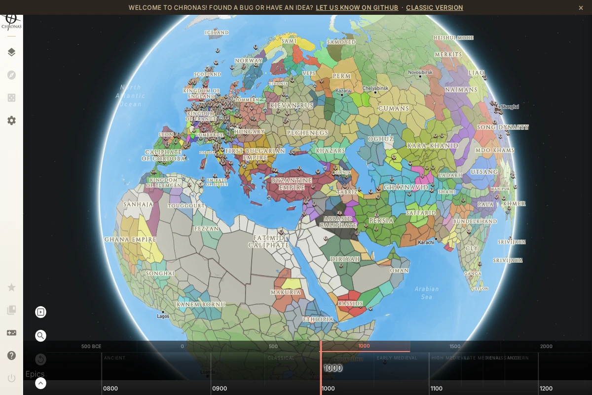
Chronas is one of those rare projects that makes you lose track of time — quite literally. It presents the entire political history of the world as a navigable 3D globe, spanning from 500 BCE all the way to the modern era. A timeline bar runs along the bottom of the screen, divided into eras from Ancient through Classical, Medieval, Renaissance, and Modern — and sliding it transforms the map in real time, redrawing borders, renaming territories, and reshuffling the colors of hundreds of polities simultaneously.\n\nAt the year 1000 AD, for instance, the map bursts with the Byzantine Empire, the Abbasid Caliphate, the Kievan Rus, the Song Dynasty, and dozens of smaller kingdoms and tribal confederacies — each rendered with its own colored region and label. The level of historical granularity is genuinely impressive, covering not just the major empires that dominate textbooks but also smaller entities like the Pechenegs, the Ghaznavids, the Srivijaya, or the Kanem-Bornu. It’s the kind of map that rewards curiosity and punishes impatience in the best possible way.\n\nThe project is open-source, with active development tracked on GitHub, and it invites community contributions for bug reports and new ideas. A “Classic Version” is also available for those who prefer the earlier interface. The community-driven nature of Chronas means its historical data continues to grow and be refined over time, making it both a tool and a living collaborative archive.\n\nFor students, history enthusiasts, game designers, or anyone who has ever wondered what the world looked like when the Vikings were raiding and the Tang Dynasty was flourishing, Chronas offers an endlessly explorable answer — rendered beautifully, at your own pace.\n\n🔗 chronas.org
...
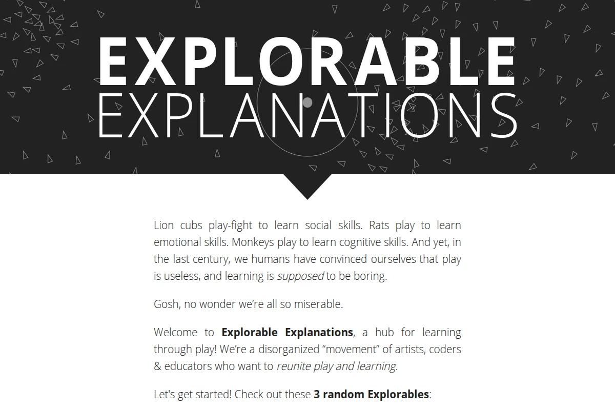
What if learning felt less like a lecture and more like play? That’s the animating question behind Explorable Explanations, a community-built hub that collects interactive essays, simulations, and toys spanning an impressive range of subjects — mathematics, physics, biology, journalism, philosophy, and more. The site opens with a disarming manifesto: lion cubs play-fight to learn social skills, rats play to acquire emotional ones, monkeys learn cognition through play — and yet humans have somehow convinced themselves that learning is supposed to be boring. The point lands.\n\nThe “explorables” themselves are the real draw. Rather than static text or passive video, each piece invites you to drag sliders, poke simulations, and observe systems changing in real time. A tutorial on trigonometry teaches by letting you aim a homing rocket. A piece on 4D geometry hands you an actual toy for “4D children.” The format, pioneered by thinkers like Bret Victor, turns explanation into a genuine dialogue between reader and idea.\n\nThe site is deliberately described as a “disorganized movement” — a loose collective of artists, coders, and educators rather than a polished institution. That roughness is part of its charm. You can browse by subject, hit a button for three random explorables, or simply view everything on a single sprawling page. The source code is open (“open sauce,” as they put it), and the community extends onto Reddit and social media for those who want to contribute their own interactive work.\n\nFor anyone who has ever felt that a diagram would be better if you could touch it, or that an equation might click if you could just play with it, Explorable Explanations is an essential bookmark. It is simultaneously a gallery, a toolkit, and a quiet argument for a better way of teaching.\n\n🔗 explorabl.es
...
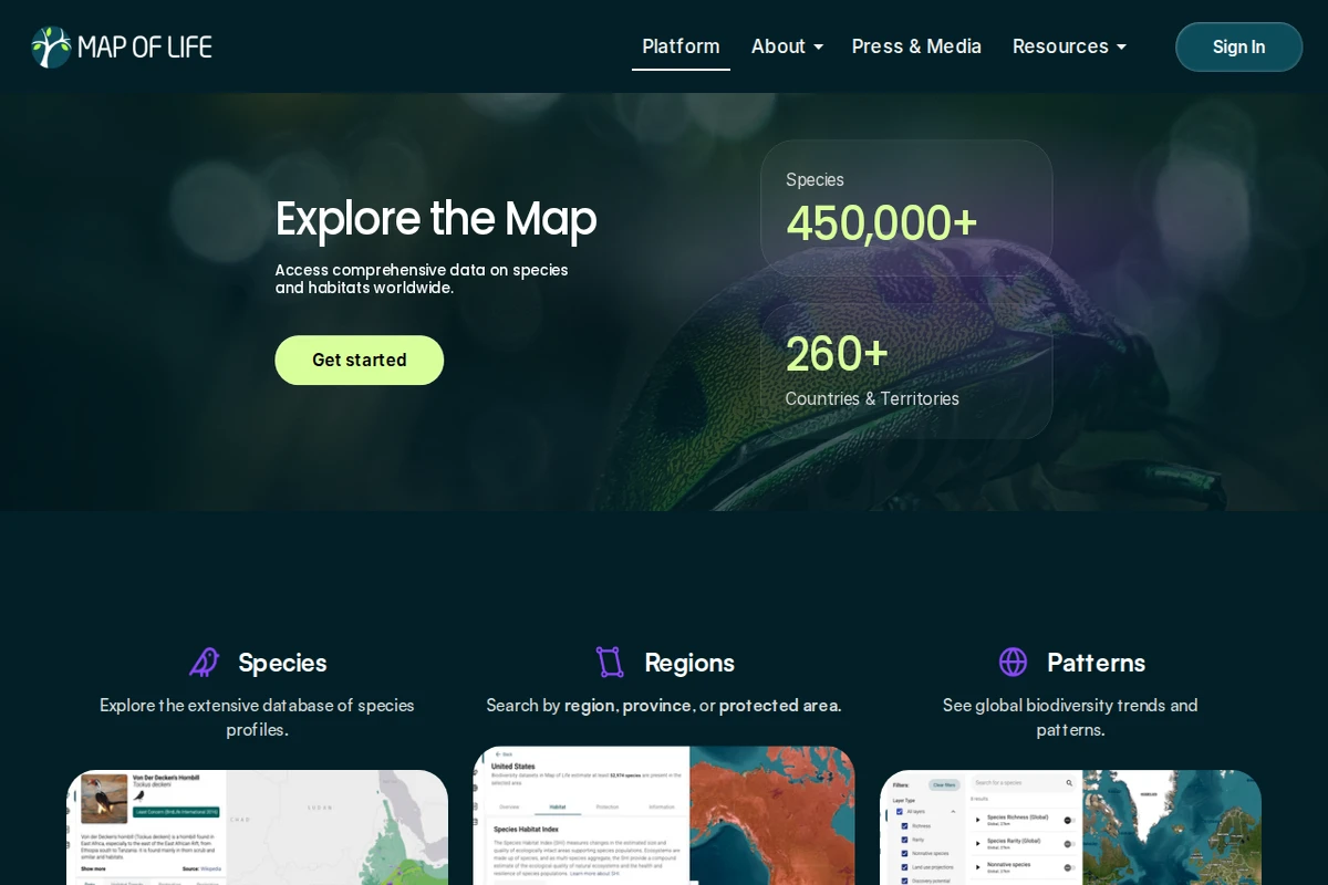
Map of Life is one of the most ambitious biodiversity data platforms on the web — a living atlas that attempts to answer a deceptively simple question: what lives where? With over 450,000 species catalogued across more than 260 countries and territories, it draws on decades of scientific research to make the distribution of life on Earth explorable by anyone with a browser.\n\nThe platform is organized around three core lenses. Through Species, users can browse detailed profiles for animals, plants, fungi, and more, each tied to geographic range data and sourced imagery. Through Regions, you can zoom into any country, province, or protected area and immediately see what species call it home, along with habitat quality metrics. The Patterns view steps back to reveal global biodiversity trends — where richness is concentrating, where it’s declining, and how ecosystems are shifting over time.\n\nWhat sets Map of Life apart from a simple species database is its role in actual conservation policy. Its Species Protection Index, Species Habitat Index, and Species Information Index have been formally adopted under the Kunming-Montreal Global Biodiversity Framework (GBF) — meaning the numbers generated here feed directly into international targets for nature protection. That’s a rare thing: a website whose outputs matter in diplomatic negotiating rooms.\n\nThe design is clean and map-centric, prioritizing exploration over information overload. Whether you’re a researcher tracking population changes, a curious naturalist wondering what beetles inhabit your province, or a policymaker needing hard indicators, Map of Life meets you where you are. It’s science made navigable — and the stakes behind it couldn’t be higher.\n\n🔗 mol.org
...
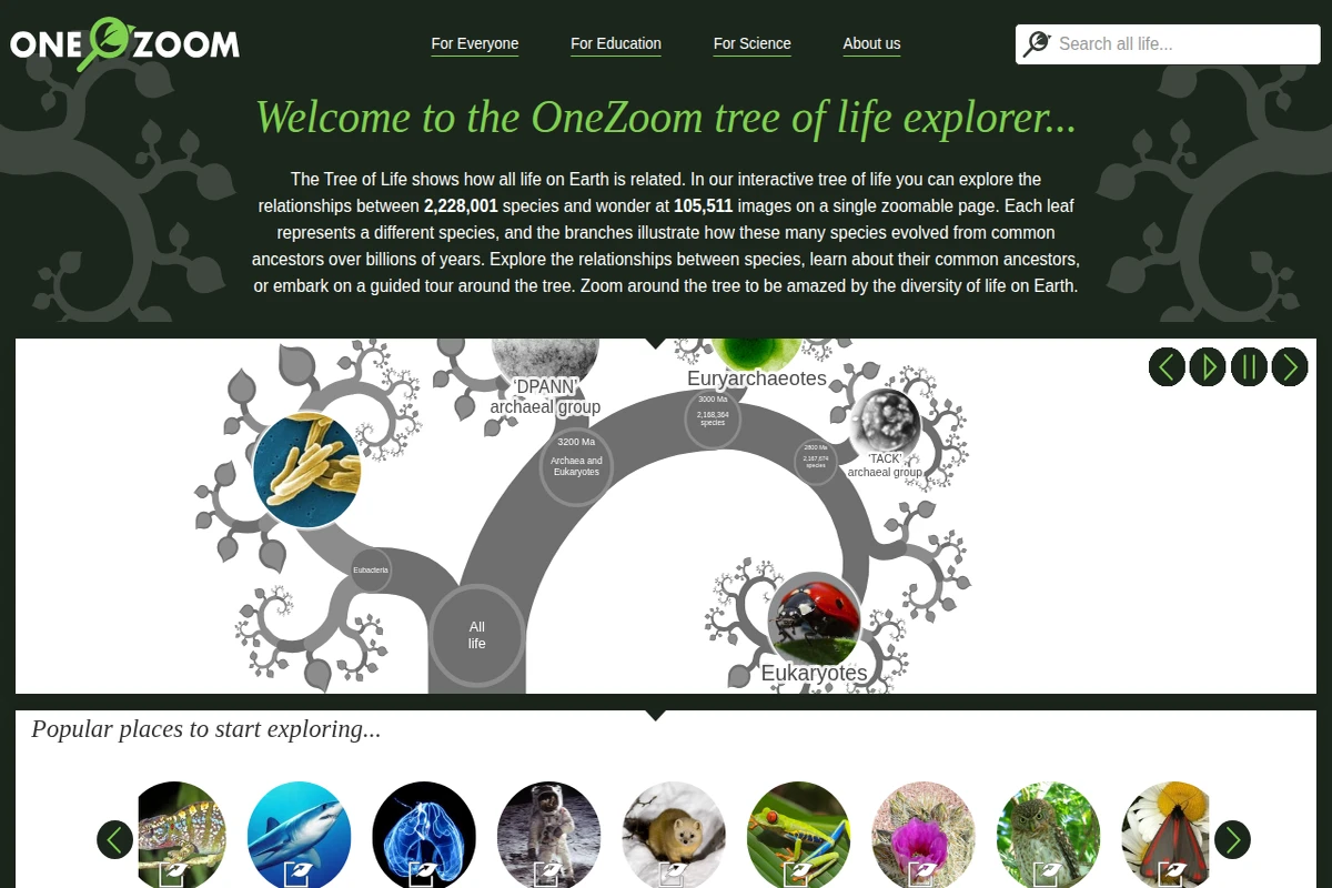
OneZoom does something genuinely extraordinary: it fits the entire known tree of life onto a single, infinitely zoomable page. With over 2,228,001 species represented as leaves and more than 105,000 photographs embedded directly into the visualization, the experience of navigating it feels less like browsing a database and more like flying through a living, branching universe. The fractal structure is not just aesthetic — it mirrors the actual logic of evolution, with branch lengths corresponding to geological time and divergence points labeled in millions of years.\n\nWhat sets OneZoom apart from typical biology resources is its sheer navigability. You can leap from humans to grey wolves to hummingbirds to hard corals, tracing shared ancestry along the way, or follow a guided tour through a particular group. The interface is intuitive enough for a curious 13-year-old and rigorous enough to earn endorsements from Richard Dawkins and Dame Georgina Mace. It genuinely bridges the gap between popular science and serious phylogenetics.\n\nThe project is run as a registered UK non-profit, which explains the absence of ads and the open ethos. Sections tailored for educators, museum installers, and researchers make it unusually versatile — it has appeared as large-format interactive installations and as an embeddable widget for scientific publications. A public API and a “popularity index” for species round out the toolkit for anyone wanting to go deeper.\n\nSponoring a leaf — literally having your name appear on a species in the tree — is a charming fundraising mechanic that also functions as a quiet meditation on scale: your name, alongside 2.2 million others. OneZoom is one of those rare websites that manages to make the abstract enormity of life on Earth feel personal and explorable.\n\n🔗 onezoom.org
...
PhET Interactive Simulations – Free Science & Math Sims
PhET Interactive Simulations is one of the most ambitious and genuinely impactful educational projects on the web. Born in 2002 at the University of Colorado Boulder under the guidance of Nobel Prize-winning physicist Carl Wieman, it set out to answer a deceptively simple question: what if students could play their way into understanding science? Two decades and 1.8 billion simulation runs later, the answer is resoundingly yes.\n\nThe library spans 173 simulations across physics, mathematics and statistics, chemistry, earth science, and biology — all free, all browser-based, and available in 132 languages. Each simulation is built on a foundation of rigorous education research, designed so that learners discover principles through hands-on experimentation rather than passive reading. You can drag electrons around a circuit, watch probability distributions emerge in real time, or manipulate molecules and immediately see how intermolecular forces change. The interface feels closer to a well-designed game than a textbook exercise.\n\nFor educators, PhET goes well beyond just providing tools. The platform hosts over 3,600 teacher-contributed lesson plans, simulation-specific teaching guides, introductory videos, and professional development workshops. A dedicated Studio tier even allows teachers to create customised versions of simulations tailored to specific classroom needs — a rare and thoughtful addition.\n\nWhat makes PhET stand out among educational platforms is its commitment to inclusive design and accessibility. The team actively works on making simulations usable with screen readers and assistive technologies, and the project has a dedicated initiative around diversity, equity, inclusion, and belonging in STEM education. The source code is open, translations are community-driven, and offline access is supported — making PhET genuinely global in reach, not just in aspiration.\n\n🔗 phet.colorado.edu
...
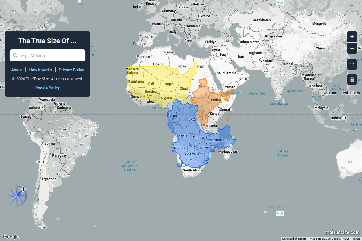
Most of us grew up with world maps that quietly lied to us. The Mercator projection — ubiquitous in classrooms, atlases, and Google Maps alike — dramatically inflates the size of landmasses near the poles while compressing those near the equator. The result is a deeply skewed mental model of the world: Greenland looks comparable to Africa, Alaska dwarfs Brazil, and Europe seems far larger than it actually is relative to Sub-Saharan countries.\n\nThe True Size Of… exists to correct that intuition in the most direct way possible. You type in the name of any country, and a coloured silhouette of it appears on the map — one that you can then drag freely across the globe. As you move it toward the poles or back toward the equator, the shape dynamically adjusts to reflect the Mercator distortion at that latitude, letting you place countries side by side for an honest comparison. The screenshot above shows exactly this: multiple African nations stacked together, revealing that the continent dwarfs what standard maps imply.\n\nWhat makes this tool so effective is its elegant simplicity. There are no tutorials required, no data tables to parse — just drag, compare, and feel the quiet shock of realising how profoundly cartographic convention has shaped your worldview. Africa, it turns out, is large enough to swallow the contiguous United States, China, India, and most of Europe simultaneously. That’s not a fun fact — it’s a correction to a decades-long optical illusion baked into our education.\n\nBeyond the “wow” moment, the site works as a genuinely useful research and teaching tool. Geography teachers, journalists, and anyone working with spatial data will find it indispensable for building accurate mental models of scale. It supports multiple languages and runs entirely in the browser, requiring nothing beyond a curiosity about the world’s actual shape.\n\n🔗 thetruesize.com
...