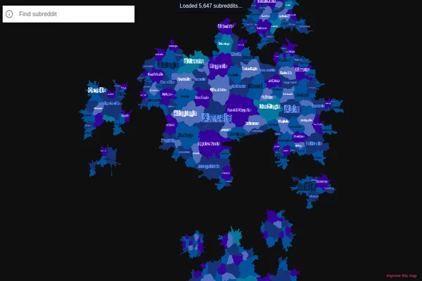
This remarkable data visualization transforms Reddit’s vast ecosystem of communities into an interactive geographical map, where each subreddit becomes a territory with borders, neighbors, and relative sizes. Created by Andrei Kashcha, this project maps over 8,000 subreddits based on user overlap patterns, creating a landscape where similar communities naturally cluster together.
The visualization reveals fascinating insights about Reddit’s social geography. Gaming communities form their own continent, while political subreddits create distinct regions that rarely overlap. Science and technology forums cluster in their own neighborhoods, and niche hobby communities form small islands connected by bridges of shared interests. The size of each territory reflects the community’s activity level, while the proximity indicates how much users move between related subreddits.
What makes this map particularly compelling is its organic emergence from actual user behavior rather than arbitrary categorization. The algorithm analyzes millions of user interactions to determine which communities share audiences, creating a natural taxonomy that reveals hidden connections and surprising relationships between seemingly unrelated topics. You can zoom in to explore individual communities or zoom out to see the broader landscape of internet culture.
This project stands as an excellent example of how complex social data can be transformed into intuitive, explorable visualizations that reveal patterns invisible in traditional list formats.