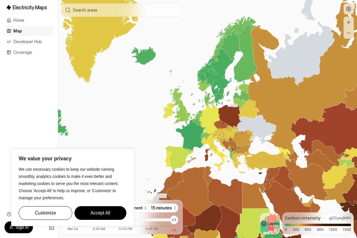
Electricity Maps transforms the invisible world of power generation into a stunning visual experience, revealing the environmental impact of our electricity consumption in real-time. This remarkable platform maps the carbon intensity of electrical grids across the globe, painting countries in different shades that correspond to how much CO₂ equivalent is emitted per kilowatt-hour of electricity produced.
What makes this tool extraordinary is its live data approach. Rather than relying on static statistics, the platform continuously updates to show how renewable energy sources like wind, solar, and hydroelectric power are actively reducing emissions throughout the day. You can watch as countries shift from dirty brown hues to cleaner greens when solar panels kick in during daylight hours or wind farms ramp up production.
The interface elegantly combines complex environmental data with intuitive design, making climate impact accessible to everyone from energy professionals to curious citizens. Each region displays precise carbon intensity measurements, allowing users to understand not just their local energy mix, but to explore global patterns of clean and dirty electricity generation.
Beyond its visual appeal, Electricity Maps serves as a powerful educational tool that connects abstract environmental concepts to tangible, real-world data. It’s particularly valuable for understanding how energy policy decisions and weather patterns directly influence our collective carbon footprint.