FlowingData stands as one of the most thoughtful and educational resources in the data visualization community, curated by statistician Nathan Yau. The site masterfully bridges the gap between technical expertise and accessible storytelling, offering both practical tools and deep insights into how data shapes our understanding of the world.
What sets FlowingData apart is its blend of technical tutorials, real-world applications, and critical analysis of data visualization in media. From exploring presidential approval ratings against gas prices to mapping space missions with stunning 3D visualizations, the site demonstrates how effective data visualization can reveal patterns and tell compelling stories. The membership section provides access to in-depth tutorials and datasets, while the public content showcases excellent examples of data journalism and visualization techniques.
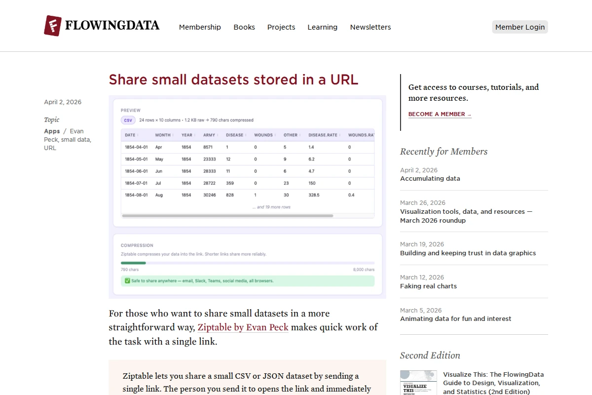
The recent spotlight on Ziptable by Evan Peck exemplifies the site’s commitment to practical tools — a simple yet elegant solution for sharing small datasets through compressed URLs without requiring servers or cloud storage. This focus on both the craft and the tools of data visualization makes FlowingData an invaluable resource for anyone interested in making sense of our data-driven world.