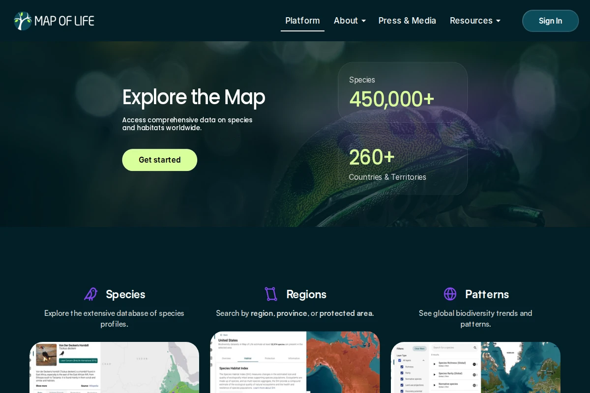
Map of Life is one of the most ambitious biodiversity data platforms on the web — a living atlas that attempts to answer a deceptively simple question: what lives where? With over 450,000 species catalogued across more than 260 countries and territories, it draws on decades of scientific research to make the distribution of life on Earth explorable by anyone with a browser.\n\nThe platform is organized around three core lenses. Through Species, users can browse detailed profiles for animals, plants, fungi, and more, each tied to geographic range data and sourced imagery. Through Regions, you can zoom into any country, province, or protected area and immediately see what species call it home, along with habitat quality metrics. The Patterns view steps back to reveal global biodiversity trends — where richness is concentrating, where it’s declining, and how ecosystems are shifting over time.\n\nWhat sets Map of Life apart from a simple species database is its role in actual conservation policy. Its Species Protection Index, Species Habitat Index, and Species Information Index have been formally adopted under the Kunming-Montreal Global Biodiversity Framework (GBF) — meaning the numbers generated here feed directly into international targets for nature protection. That’s a rare thing: a website whose outputs matter in diplomatic negotiating rooms.\n\nThe design is clean and map-centric, prioritizing exploration over information overload. Whether you’re a researcher tracking population changes, a curious naturalist wondering what beetles inhabit your province, or a policymaker needing hard indicators, Map of Life meets you where you are. It’s science made navigable — and the stakes behind it couldn’t be higher.\n\n🔗 mol.org
Map of Life — Global Biodiversity Atlas