A curated selection of unique, niche, and fascinating websites in both Polish and English.
Welcome to the Cogimator.net Web Directory – a curated space for exploring unique and often overlooked websites. This is not just another list of popular platforms, but a hand-picked collection of projects that stand out through originality, design, storytelling, or unexpected utility.
This web directory features experimental interactions, visual gems, educational treasures, and cultural initiatives from around the world – all documented with descriptions, tags, and direct links. The directory is bilingual, offering separate sections for Polish and English language content.
Check back often – new discoveries are added regularly.
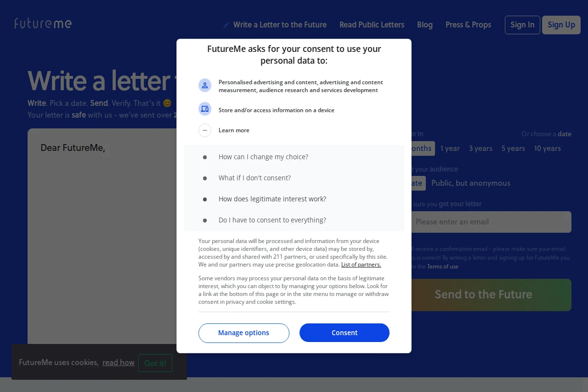
FutureMe stands as one of the internet’s most enduring and heartfelt experiments in digital time travel. For over two decades, this simple yet profound service has been helping people connect with their future selves by writing letters that get delivered months or years later. The concept is elegantly straightforward: write a message, pick a delivery date, and wait for your past self to surprise your future self.
What makes FutureMe particularly compelling is its longevity and scale. Having facilitated over 20 million letters since 2002, it’s become a repository of human hopes, dreams, and personal growth. The platform offers both private messaging and anonymous public sharing, creating an unexpected archive of collective human experience. Reading the public letters reveals touching snapshots of people setting goals, processing emotions, or simply trying to capture a moment in time.
...
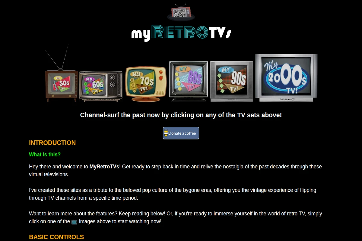
MyRetroTVs - Virtual Channel Surfing Through Past Decades
MyRetroTVs transforms your browser into a time machine, offering an authentic channel-surfing experience through six different decades of television history. Each virtual TV set — from the wood-paneled 50s model to the sleek 2000s flat screen — comes loaded with period-appropriate content that captures the essence of its era.
The attention to detail is remarkable: vintage picture noise levels, authentic static transitions between channels, and even decade-specific visual effects like the black-and-white toggle for the 70s set. You can filter content by type (music videos, commercials, shows), adjust the nostalgic glow effect, or enable shuffle mode to randomly jump between years. The keyboard shortcuts and remote control interface feel genuinely retro while remaining intuitive.
...
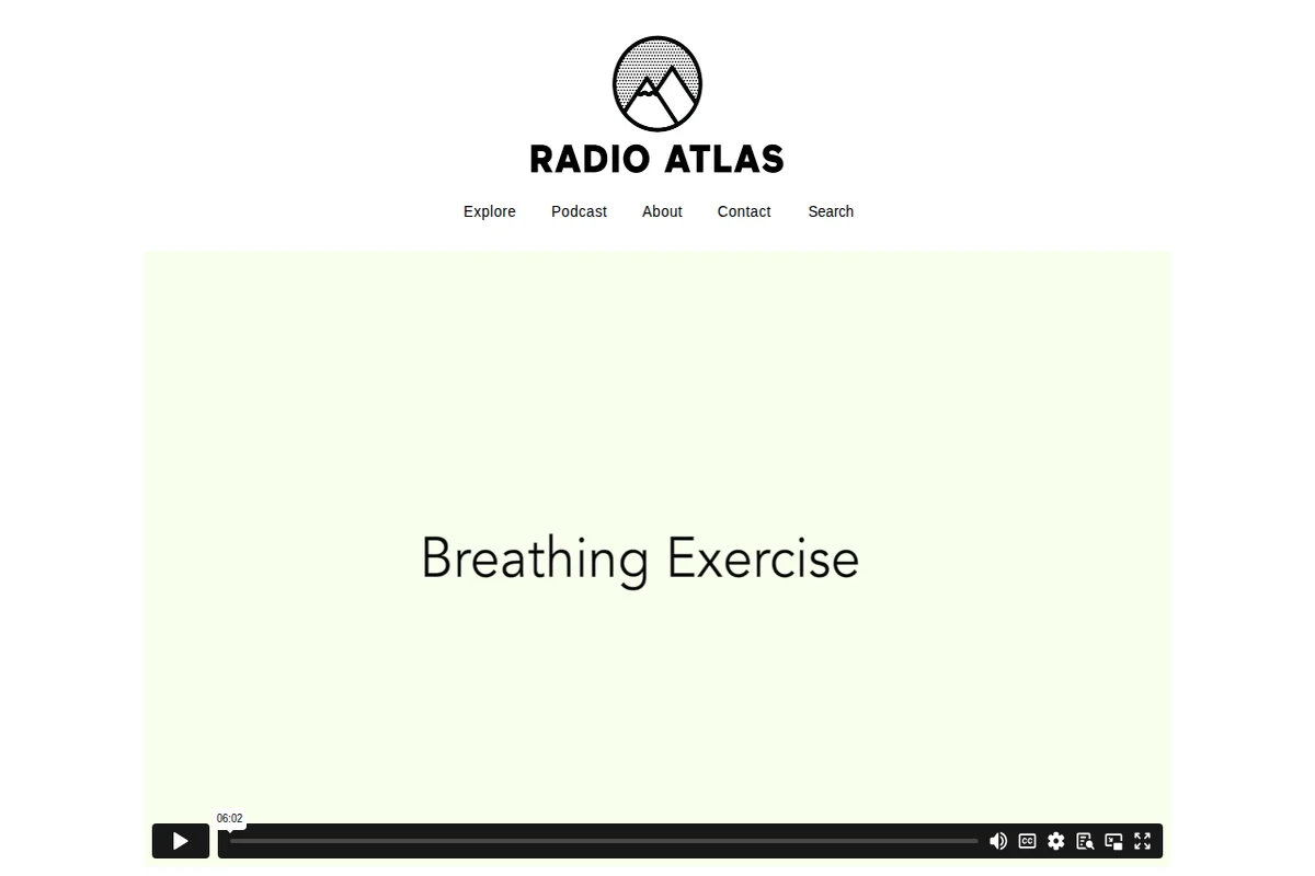
Radio Atlas - Breathing Exercise Audio Documentary
Radio Atlas presents a fascinating collection of experimental audio documentaries that blur the boundaries between journalism, art, and personal reflection. The platform showcases work by innovative sound artists who explore intimate human experiences through the medium of radio.
The featured piece, Breathing Exercise by Judith Geffert, exemplifies this approach with its meditation on the most fundamental yet overlooked aspect of human existence. Created for THE ECCO, an audio community project, this work emerged from a collaborative retreat process in Italy and was refined through months of peer review. Geffert, a Berlin-based radio maker originally from Magdeburg, specializes in experimental features that navigate the thin lines between different forms of storytelling.
...
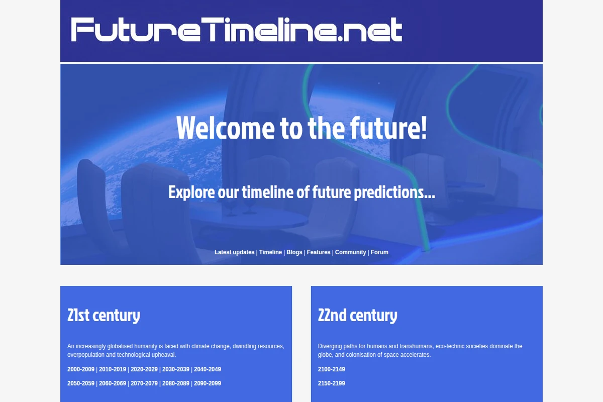
Future Timeline - Interactive Predictions Through the Centuries
Future Timeline presents one of the most comprehensive attempts to map humanity’s long-term future, stretching from our current century through to cosmic scales of time. This remarkable resource organizes predictions and speculations across multiple disciplines, from climate science and artificial intelligence to space colonization and the ultimate fate of consciousness itself.
The site’s structure is elegantly chronological, beginning with the challenges of our globalized 21st century—climate change, resource depletion, and technological upheaval—before expanding into increasingly speculative territory. The 22nd century explores diverging paths for humans and transhumans, while the far future contemplates post-biological humanity spreading throughout the galaxy. What sets this project apart is its serious engagement with both near-term scientific consensus and far-future theoretical possibilities.
...
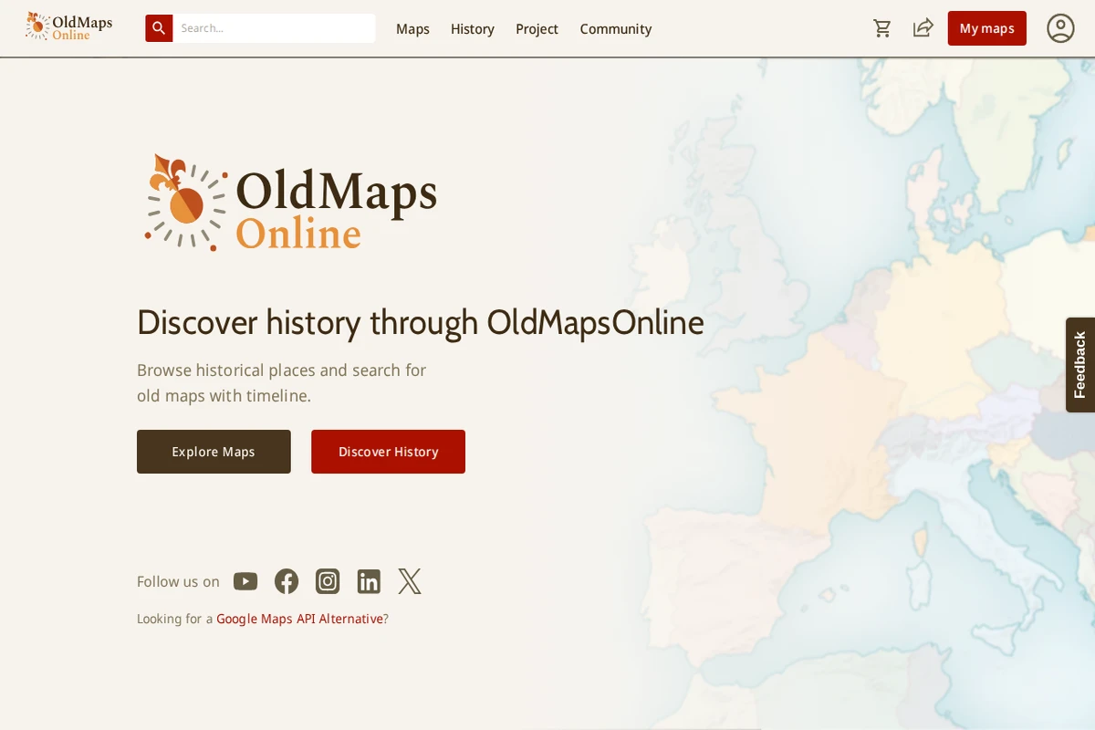
OldMapsOnline - Historical Maps Archive and Explorer
OldMapsOnline represents one of the most ambitious efforts to digitize and catalog the world’s cartographic heritage. This remarkable platform brings together thousands of historical maps from libraries, archives, and collections worldwide, making centuries of geographical knowledge accessible through an intuitive timeline-based interface.
What sets this project apart is its sophisticated search functionality that allows users to explore maps by location, time period, and scale. The platform seamlessly integrates historical cartography with modern mapping technology, enabling users to overlay old maps onto contemporary geographical references. Each map entry includes detailed metadata about publishers, dates, scales, and provenance, creating a scholarly resource that serves both researchers and curious explorers.
...
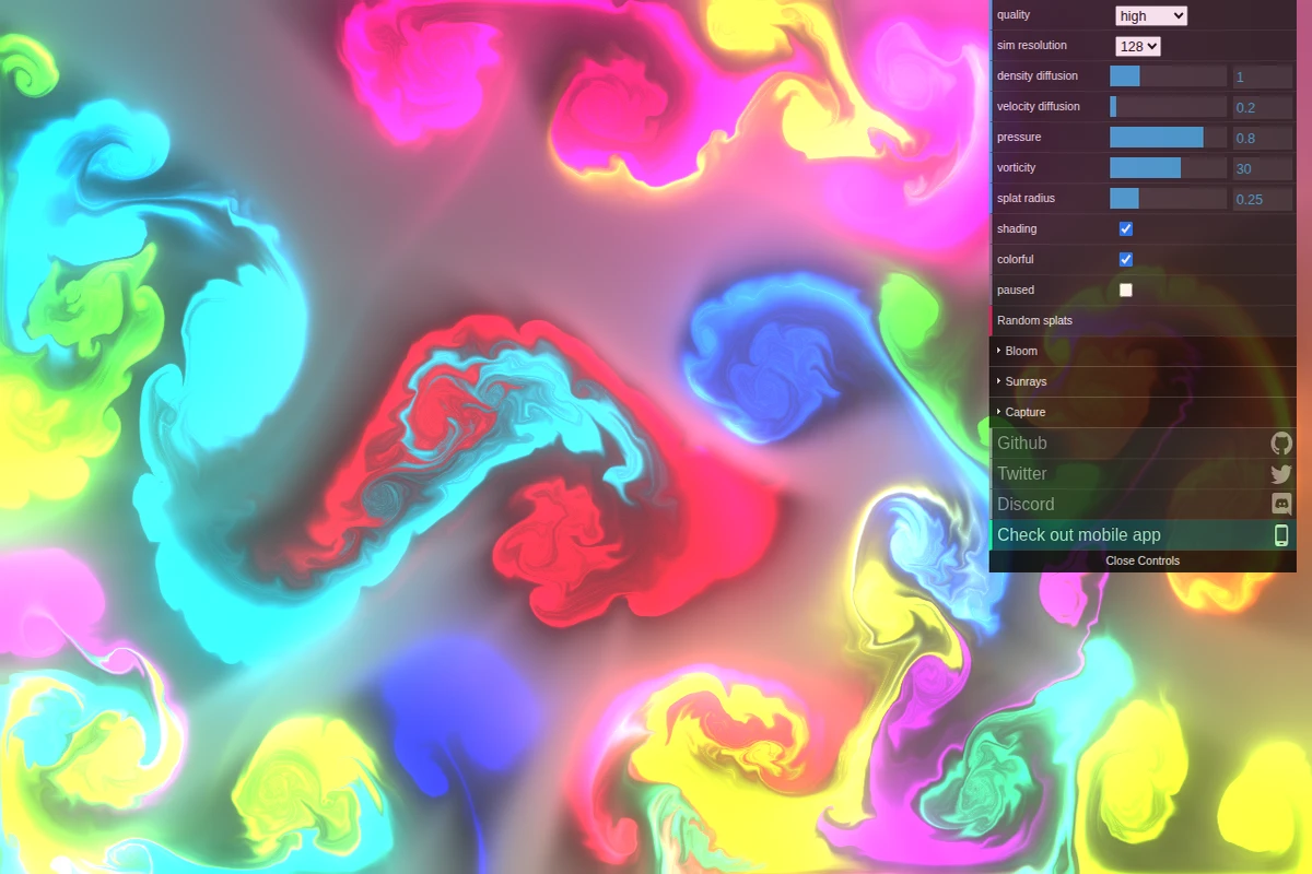
This stunning WebGL fluid simulation transforms your browser into a physics playground where every mouse movement creates ripples of liquid color. Developed by Pavel Dobryakov, the simulation demonstrates sophisticated computational fluid dynamics running entirely in real-time through WebGL shaders.
The interface offers remarkable control over the physics parameters — adjust density diffusion to make colors blend more smoothly, crank up vorticity for more turbulent swirls, or modify pressure settings to change how the fluid responds to disturbances. The visual effects are equally impressive, with optional bloom lighting and sunray effects that make the flowing colors appear almost luminescent against the dark canvas.
...
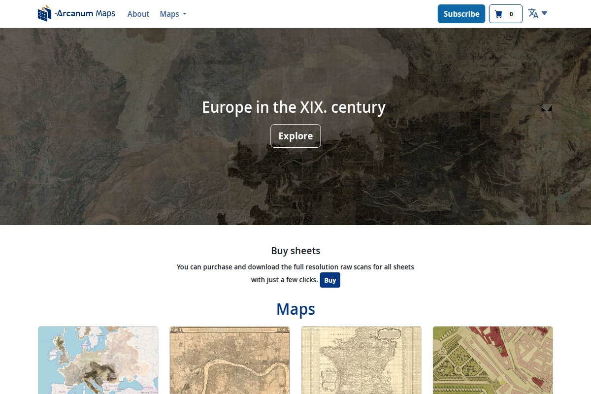
Arcanum Maps - Historical European Cartography Archive
Arcanum Maps presents a meticulously curated collection of historical European cartography, with a particular emphasis on 19th-century materials. This digital archive serves as a bridge between historical scholarship and modern accessibility, offering researchers, historians, and map enthusiasts high-quality digitized versions of period maps that would otherwise remain locked away in archives and libraries.
The platform’s strength lies in its comprehensive coverage of European territories during a pivotal century of political and geographical transformation. From detailed city plans to broad national surveys, the collection captures the cartographic documentation of an era when Europe was reshaping itself through industrialization, nationalism, and imperial expansion. The interface allows users to explore these historical documents with contemporary ease while maintaining scholarly rigor.
...
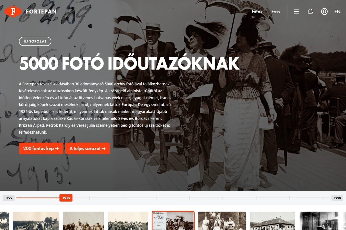
Fortepan represents one of the most remarkable digital preservation projects in Central Europe, having grown from a modest collection of 5,000 photographs found at flea markets into a treasure trove of over 200,000 historical images. What started as a passion project in 2010 has evolved into Hungary’s premier community-driven photo archive, where memories rescued from forgotten drawers and attics find new life online.
The platform’s current spring release showcases 5,000 newly donated photographs from 30 contributors, with an exceptional focus on travel photography spanning from early 20th-century alpine expeditions to 1950s-60s European tours through Italy, West Germany, and France. These images offer fascinating glimpses into how Hungarians viewed Europe throughout different eras, while also revealing how foreign visitors perceived Hungary through the lens of a Swedish traveler’s 1935 photographs.
...
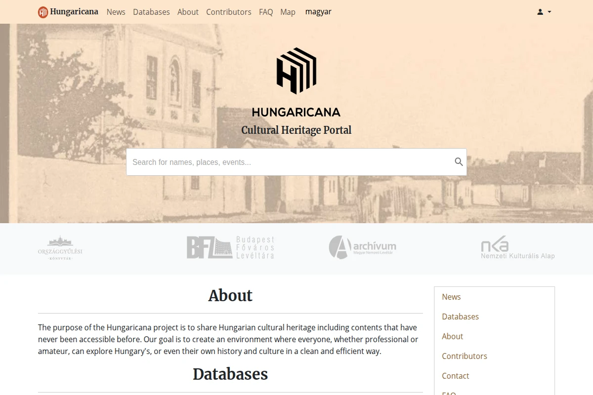
Hungaricana - Hungarian Cultural Heritage Digital Portal
Hungaricana represents one of Europe’s most ambitious digital heritage projects, serving as Hungary’s comprehensive cultural portal that makes centuries of historical materials accessible to researchers and curious minds worldwide. The platform aggregates content from major Hungarian cultural institutions, including the National Library, National Archives, and various museums, creating a unified gateway to explore the nation’s rich historical tapestry.
The portal’s strength lies in its diverse collection categories, spanning from medieval manuscripts and historical maps to folk music recordings and photographic archives. Users can navigate through the Budapest Time Machine to explore the capital’s urban evolution, browse extensive map collections that document territorial changes over centuries, or dive into folk music archives that preserve traditional Hungarian melodies. The search functionality allows both professional researchers and amateur historians to discover connections across different media types and time periods.
...
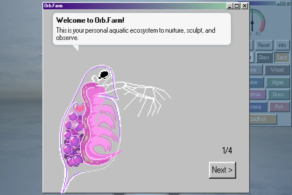
Orb.Farm presents a delightfully pixelated take on ecosystem simulation, inviting users to cultivate their own miniature aquatic worlds within a web browser. This charming digital terrarium combines the meditative qualities of fishkeeping with the experimental joy of building balanced ecosystems from scratch.
The interface reveals itself as both intuitive and surprisingly deep, offering an array of biological and environmental elements to experiment with. Users can introduce fish, algae, bacteria, and daphnia into their virtual aquariums, then observe how these organisms interact, compete, and coexist. The addition of physical materials like sand, glass, wood, and stone allows for creative habitat design, while environmental controls for oxygen and CO2 levels add scientific depth to the experience.
...