A curated selection of unique, niche, and fascinating websites in both Polish and English.
Welcome to the Cogimator.net Web Directory – a curated space for exploring unique and often overlooked websites. This is not just another list of popular platforms, but a hand-picked collection of projects that stand out through originality, design, storytelling, or unexpected utility.
This web directory features experimental interactions, visual gems, educational treasures, and cultural initiatives from around the world – all documented with descriptions, tags, and direct links. The directory is bilingual, offering separate sections for Polish and English language content.
Check back often – new discoveries are added regularly.
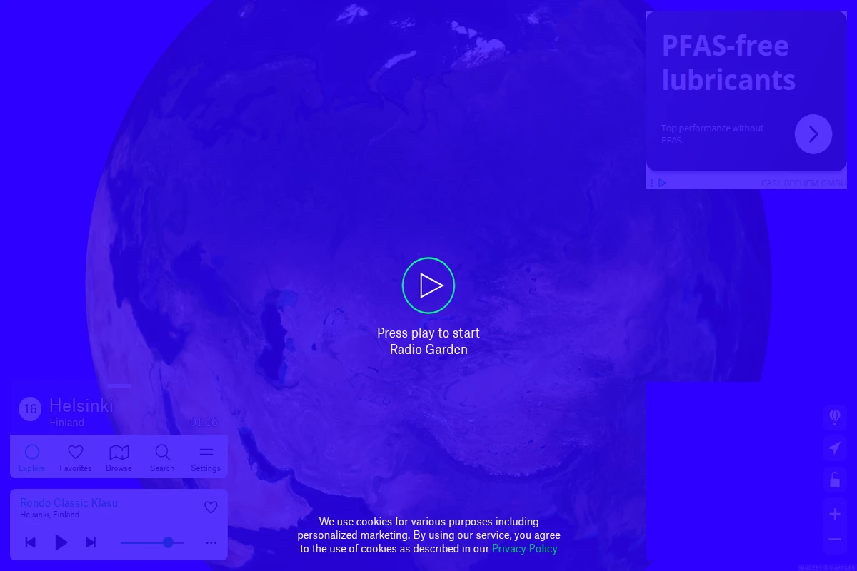
Radio Garden - Interactive Globe of World Radio Stations
Radio Garden transforms the simple act of radio listening into a mesmerizing journey around the planet. This beautifully crafted interactive globe presents thousands of live radio stations as glowing green dots scattered across a realistic 3D Earth, inviting you to explore the world’s soundscape with nothing more than a click.
The experience is delightfully intuitive — simply spin the globe, zoom into any region that catches your eye, and click on the pulsing dots to instantly tune into local radio stations. Whether you find yourself listening to morning news in Tokyo, folk music from rural Romania, or late-night jazz from a small town in Brazil, each station offers an authentic window into its local culture and daily rhythm.
...
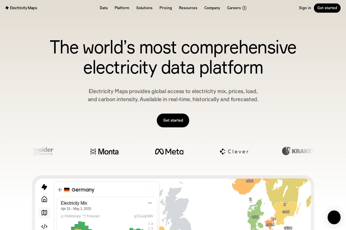
Electricity Maps: Real-Time Global Grid Data Platform
Electricity Maps stands as the world’s most comprehensive electricity data platform, offering unprecedented visibility into global power grids across more than 190 countries. This remarkable resource transforms the complex world of energy data into accessible, actionable insights that span electricity mix composition, carbon intensity measurements, real-time pricing, and grid load information.
The platform’s true strength lies in its temporal comprehensiveness—users can access eight years of historical data, monitor real-time conditions, and explore forecasts up to 72 hours ahead. Whether you’re tracking renewable energy penetration in Germany, analyzing carbon emissions patterns, or monitoring electricity prices across European markets, Electricity Maps delivers standardized, harmonized data that makes cross-regional comparisons meaningful and reliable.
...
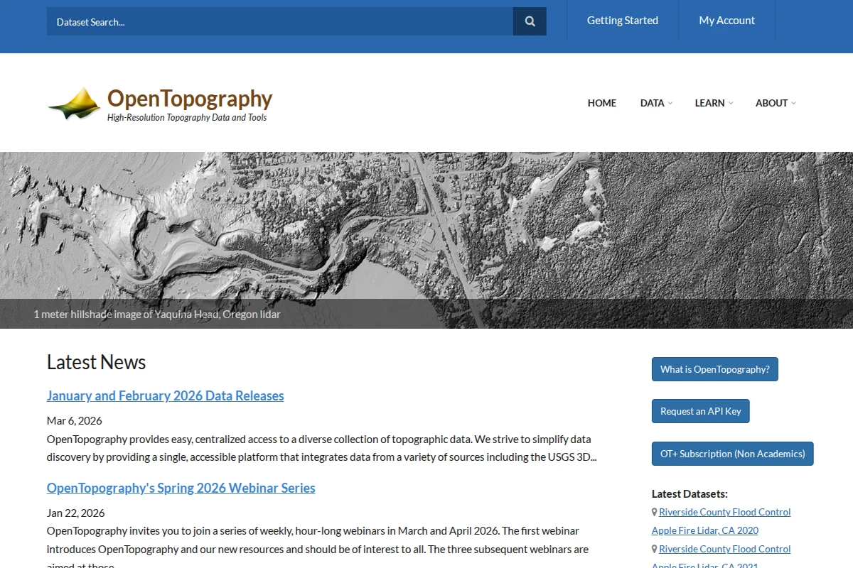
OpenTopography - High-Resolution Topographic Data and Tools
OpenTopography represents a remarkable achievement in democratizing access to high-resolution topographic data. This NSF-supported platform serves as a centralized hub where researchers, educators, and professionals can easily discover and access diverse collections of terrain data, including lidar point clouds, radar datasets, and digital elevation models from sources like the USGS 3D Elevation Program.
What sets OpenTopography apart is its commitment to simplifying the traditionally complex world of geospatial data. The platform integrates datasets covering over 500,000 km² globally, offering both web-based point-and-click access for casual users and sophisticated programmatic tools for researchers building automated workflows. The site features everything from detailed hillshade visualizations of Oregon’s coastline to 3D point cloud data of Colorado’s Flatirons, making complex topographic information accessible to a broad audience.
...
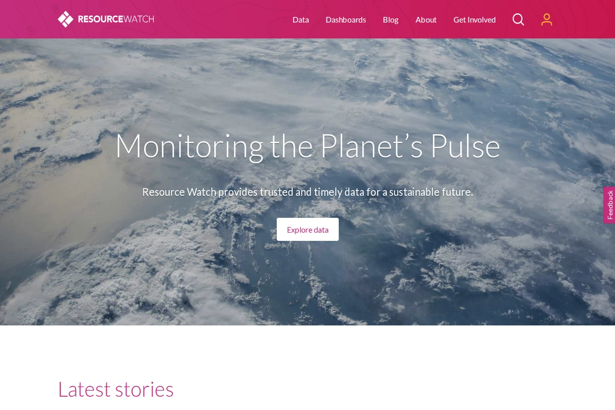
Resource Watch - Global Environmental Data Platform
Resource Watch stands as one of the most comprehensive environmental data platforms available today, offering a remarkable window into our planet’s vital signs. Developed by the World Resources Institute, this ambitious project aggregates trusted datasets from around the globe to help researchers, policymakers, and citizens understand the complex environmental challenges facing humanity.
The platform excels in making vast amounts of environmental data accessible through intuitive visualizations and interactive dashboards. Users can explore everything from deforestation patterns and ocean health indicators to urban air quality and climate data. The site features specialized collections covering eight major themes: Energy, Forests, Ocean Watch, Food, Society, Climate, Cities, and Water. Each dashboard presents curated data stories that reveal patterns and connections across different environmental systems.
...
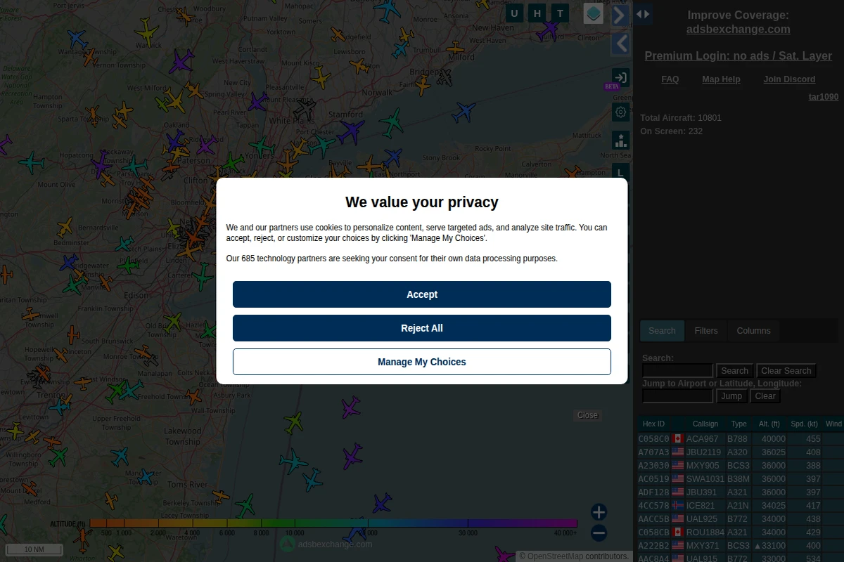
ADS-B Exchange represents one of the most comprehensive and open aircraft tracking platforms available today, offering real-time visibility into global aviation activity. Unlike commercial flight tracking services, this community-driven project provides unfiltered access to aircraft data, showing everything from commercial airliners to private jets, military aircraft, and emergency services.
The platform displays live aircraft positions using Automatic Dependent Surveillance-Broadcast (ADS-B) technology, where aircraft continuously transmit their GPS coordinates, altitude, speed, and identification data. The interface presents this information through an interactive map populated with colorful aircraft icons, each representing a real flight in progress. Users can access detailed flight information including hex codes, callsigns, aircraft types, altitudes, and ground speeds for thousands of simultaneous flights.
...
Global Fishing Watch: Ocean Transparency Through Technology
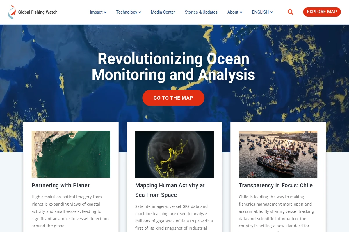
Global Fishing Watch represents a groundbreaking fusion of satellite technology, artificial intelligence, and marine conservation that’s transforming how we understand human activity at sea. This remarkable platform processes millions of gigabytes of data to create the world’s first comprehensive, real-time map of industrial fishing activity across our planet’s oceans.
Founded through a collaboration between Oceana, SkyTruth, and Google, the platform harnesses cutting-edge technology including high-resolution optical imagery from Planet satellites, vessel GPS tracking data, and sophisticated machine learning algorithms. The result is an unprecedented level of transparency that enables researchers, policymakers, and the public to monitor fishing vessels, detect illegal activities, and understand patterns of ocean use like never before.
...
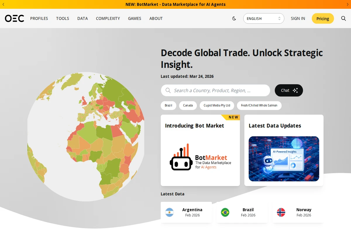
The Observatory of Economic Complexity (OEC) stands as one of the most comprehensive global trade intelligence platforms available today. This remarkable resource transforms complex economic data into accessible visualizations, covering over 5,000 products, 5,700 subnational regions, and detailed trade relationships between 190+ countries. The platform’s strength lies in its ability to decode intricate global trade patterns and present them through intuitive maps, networks, and interactive charts.
What sets the OEC apart is its focus on Economic Complexity — a sophisticated metric that measures the knowledge and capabilities embedded in a country’s productive structure. Users can explore how nations develop comparative advantages, predict export opportunities, and understand the evolutionary pathways of economic development. The platform offers powerful analytical tools including tariff simulators, growth predictions, and export potential assessments that help researchers, policymakers, and businesses make data-driven decisions.
...
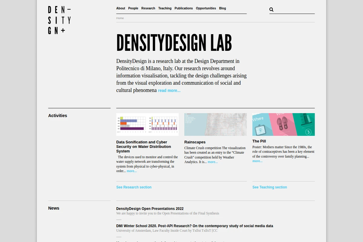
DensityDesign represents one of the most compelling intersections of design thinking and data science in contemporary academic research. Based at Milan’s prestigious Politecnico di Milano, this research lab has carved out a distinctive niche by approaching information visualization not merely as a technical challenge, but as a profound design problem that requires careful consideration of how we communicate complex social and cultural phenomena.
The lab’s work spans an impressive range of applications, from cyber-security visualization for water distribution systems to climate data representation and social media research methodologies. What sets DensityDesign apart is their commitment to tackling real-world problems through the lens of visual communication design. Their projects demonstrate how thoughtful visualization can make abstract data tangible and accessible, whether they’re mapping informal transport networks or exploring the cultural implications of contraceptive use through poster design.
...
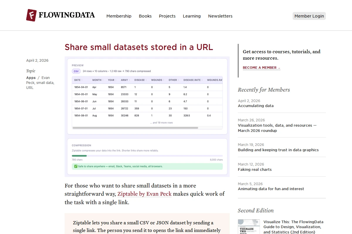
FlowingData — Making Sense of Data Through Visualization
FlowingData stands as one of the most thoughtful and educational resources in the data visualization community, curated by statistician Nathan Yau. The site masterfully bridges the gap between technical expertise and accessible storytelling, offering both practical tools and deep insights into how data shapes our understanding of the world.
What sets FlowingData apart is its blend of technical tutorials, real-world applications, and critical analysis of data visualization in media. From exploring presidential approval ratings against gas prices to mapping space missions with stunning 3D visualizations, the site demonstrates how effective data visualization can reveal patterns and tell compelling stories. The membership section provides access to in-depth tutorials and datasets, while the public content showcases excellent examples of data journalism and visualization techniques.
...
In an age where information overload is the norm, Visual Capitalist stands out as a masterclass in data storytelling. This platform transforms dry statistics and complex economic indicators into visually compelling narratives that make global trends accessible to everyone. Whether you’re tracking China’s surging debt levels, exploring America’s data center construction boom, or understanding which countries are leading in AI patents, Visual Capitalist presents it all through beautifully crafted infographics and interactive visualizations.
...