A curated selection of unique, niche, and fascinating websites in both Polish and English.
Welcome to the Cogimator.net Web Directory – a curated space for exploring unique and often overlooked websites. This is not just another list of popular platforms, but a hand-picked collection of projects that stand out through originality, design, storytelling, or unexpected utility.
This web directory features experimental interactions, visual gems, educational treasures, and cultural initiatives from around the world – all documented with descriptions, tags, and direct links. The directory is bilingual, offering separate sections for Polish and English language content.
Check back often – new discoveries are added regularly.
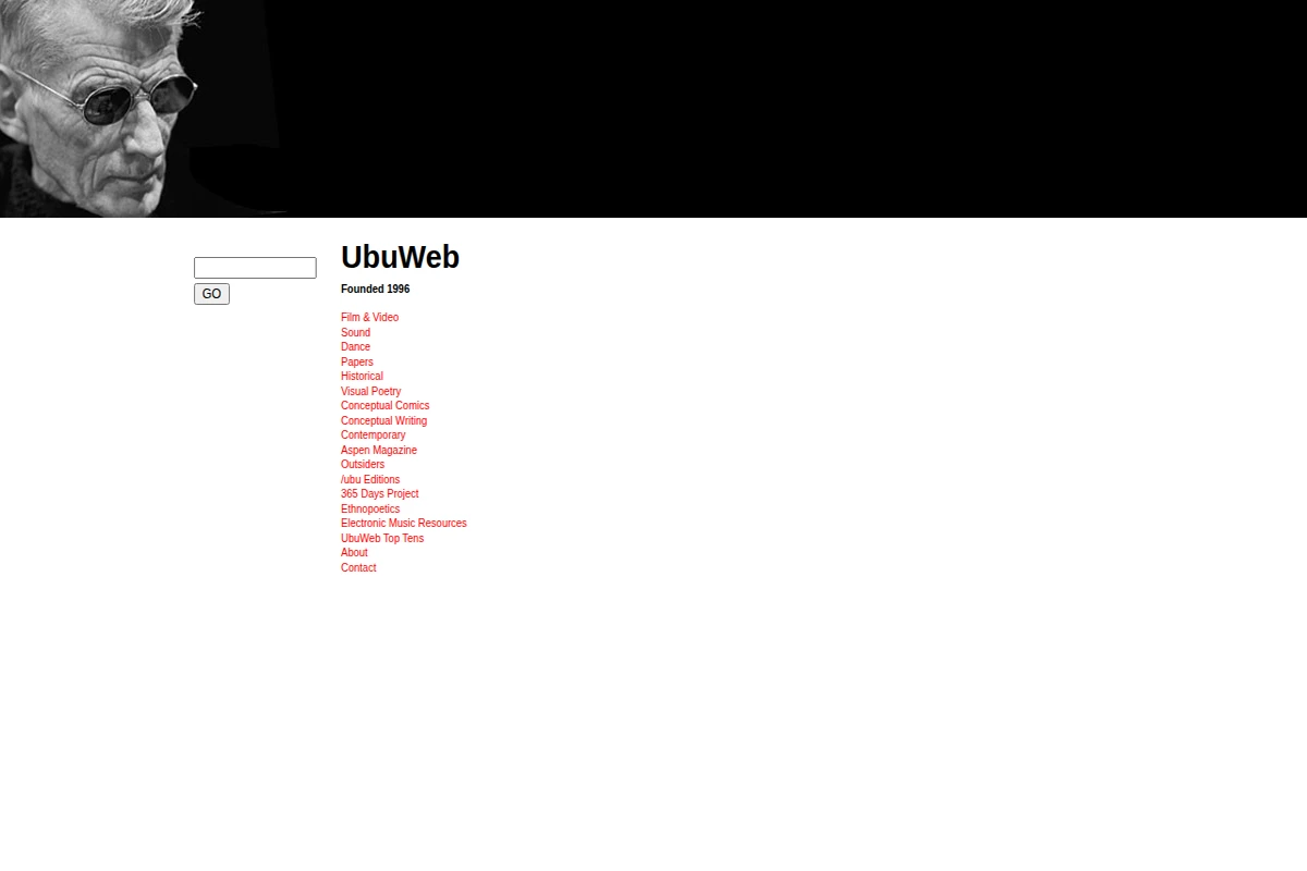
UbuWeb stands as one of the internet’s most important cultural archives, quietly preserving the experimental edges of human creativity since 1996. Founded by poet Kenneth Goldsmith, this sprawling digital repository has become the unofficial museum of avant-garde culture, housing everything from concrete poetry and sound art to conceptual films and underground comics.
What makes UbuWeb extraordinary is its commitment to accessibility over profit. The site operates as a gift economy, freely sharing rare recordings of John Cage performances, experimental films by Maya Deren, and conceptual writing that challenges traditional literary boundaries. Its collections span movements from Fluxus to Language Poetry, from electronic music pioneers to contemporary sound artists pushing the boundaries of what constitutes art.
...
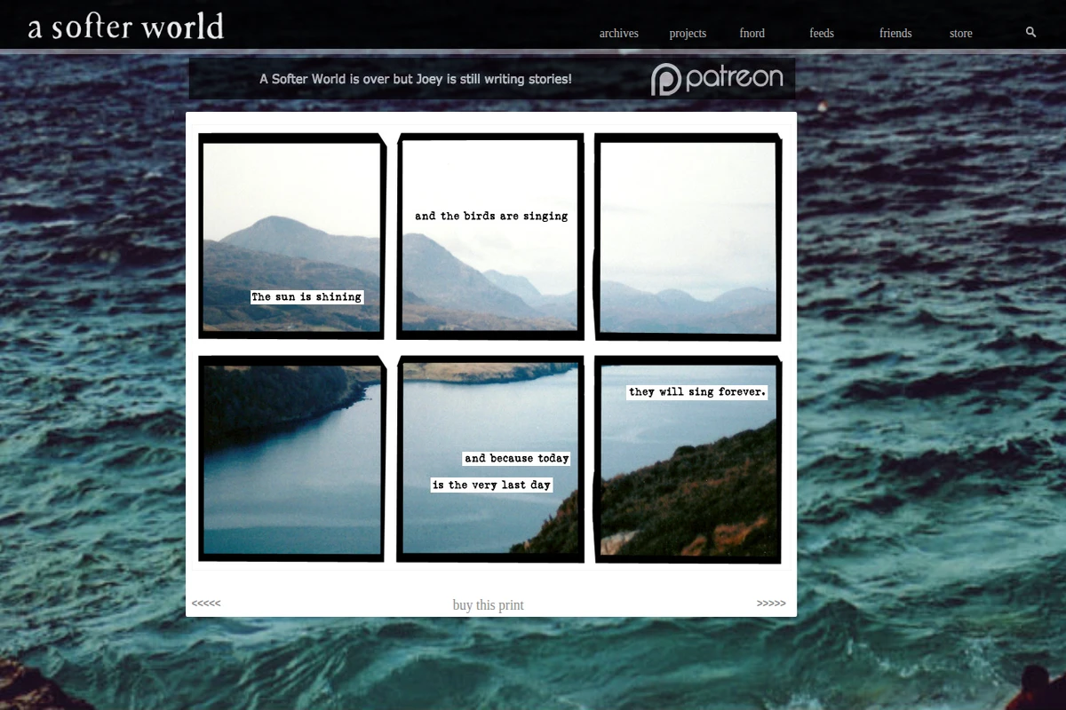
A Softer World stands as one of the most distinctive and emotionally resonant webcomics ever created. For twelve years, creators Joey Comeau and Emily Horne crafted a unique form of visual poetry, pairing evocative photography with sparse, typewritten text fragments that captured the melancholy and beauty of everyday existence.
The comic’s format was deceptively simple: three panels, usually featuring atmospheric photographs of landscapes, urban scenes, or intimate moments, overlaid with brief text snippets that read like fragments from a diary or overheard conversations. Yet within this minimalist framework, the creators explored profound themes of love, mortality, relationships, and the quiet desperation that underlies much of human experience. Each strip felt like a small revelation, a moment of recognition that made readers pause and reflect.
...
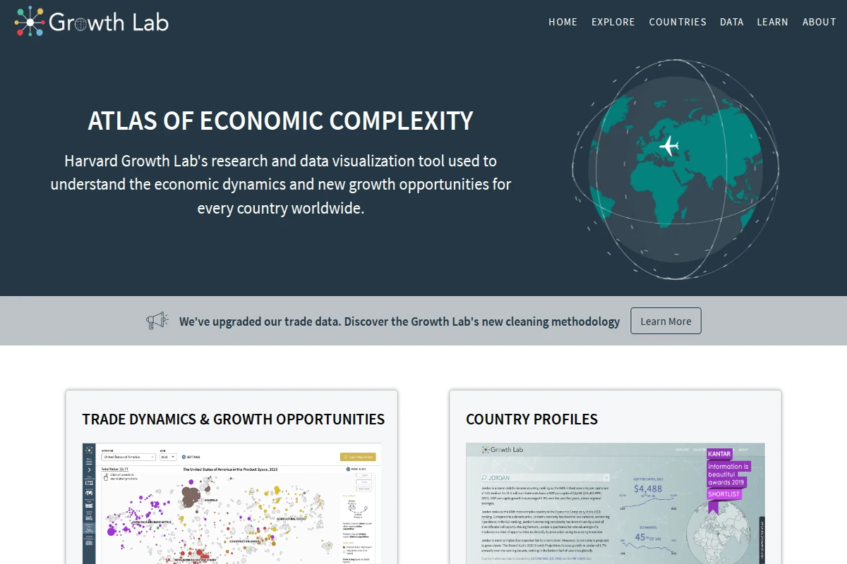
The Atlas of Economic Complexity represents one of the most sophisticated attempts to map and understand the intricate web of global economic relationships. Developed by Harvard’s Growth Lab, this remarkable platform transforms decades of trade data into compelling visual narratives that reveal how countries develop their productive capabilities over time.
At its core, the Atlas employs the concept of economic complexity — the idea that a country’s economic sophistication can be measured by the diversity and uniqueness of its exports. Through stunning interactive visualizations, users can explore trade dynamics, country profiles, and growth projections that span more than half a century. The platform’s product space visualizations are particularly striking, showing how different products cluster together based on the capabilities required to produce them.
...
Earth: Real-time Global Wind and Weather Visualization
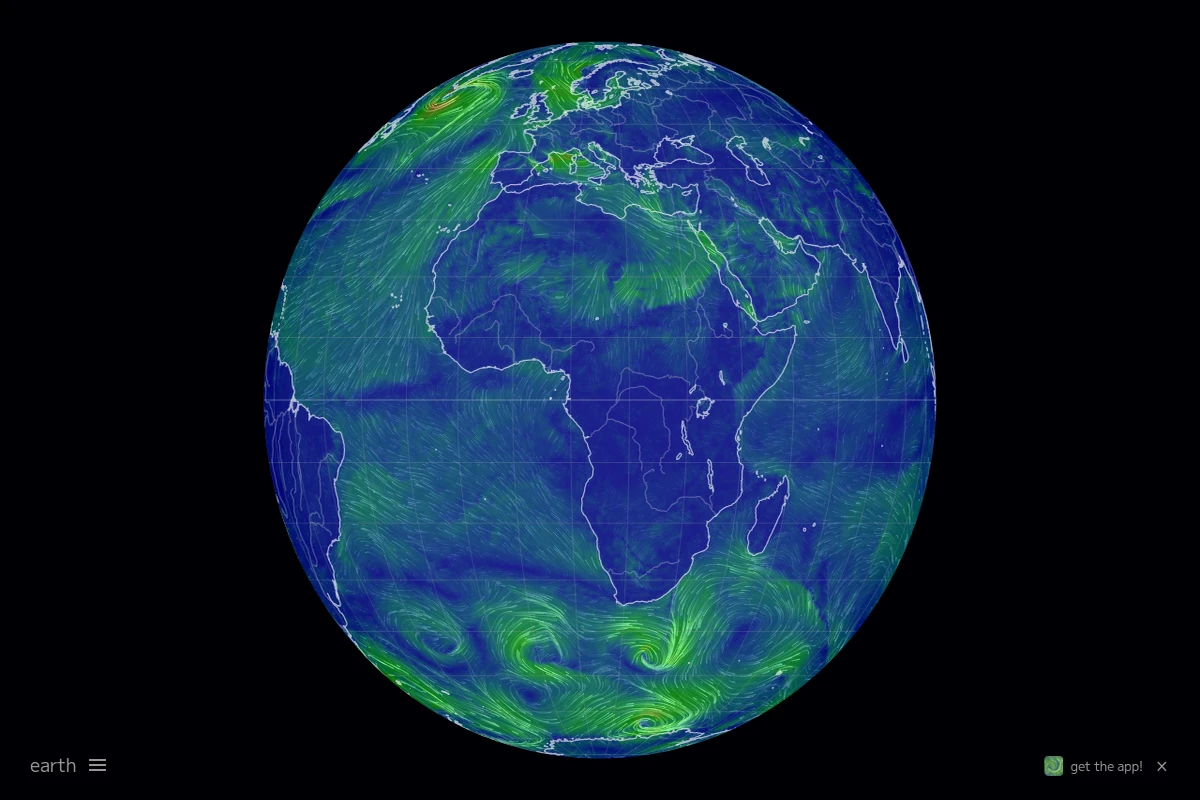
Earth transforms complex meteorological data into one of the most beautiful and intuitive weather visualizations ever created. This interactive globe displays real-time wind patterns, ocean currents, temperature gradients, and atmospheric conditions through flowing animated particles that dance across the planet’s surface. The result is both scientifically accurate and visually stunning — watching storm systems swirl or trade winds flow becomes an almost meditative experience.
The project, created by Cameron Beccario, sources data from multiple meteorological organizations including NOAA, updating every three hours to maintain accuracy. Users can explore different atmospheric layers, from surface winds to jet streams at 250 hPa, and switch between various weather parameters including temperature, humidity, and precipitation. The smooth WebGL rendering ensures the visualization runs beautifully on modern browsers while maintaining scientific precision.
...
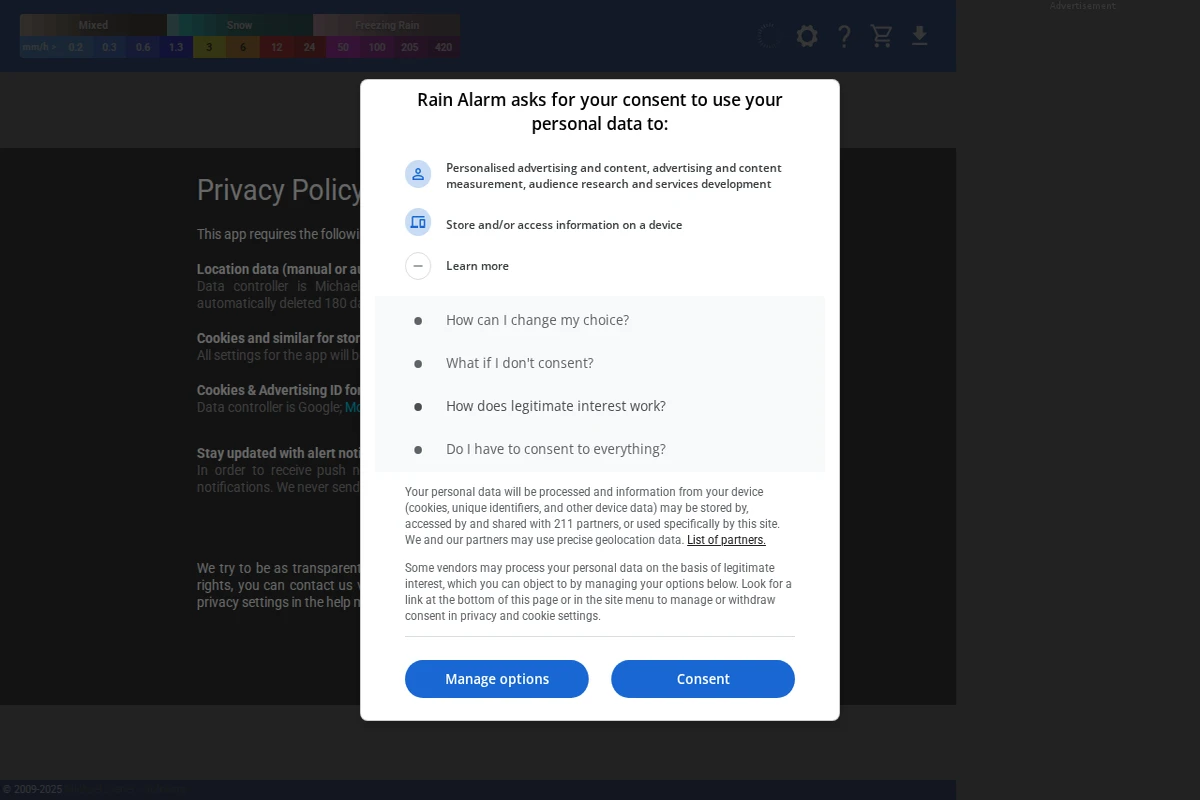
Rain Alarm - Real-time Weather Radar and Precipitation Alerts
Rain Alarm transforms weather awareness with its sophisticated real-time precipitation tracking system. This isn’t just another weather app — it’s a precision tool that monitors rain patterns across your region and delivers timely alerts before the first drops fall. The interface presents a clean, color-coded radar map showing precipitation intensity from light drizzle to heavy downpours, with measurements ranging from 0.2mm/h to over 420mm/h.
What sets Rain Alarm apart is its proactive notification system that calculates exactly when rain will reach your specific location. Whether you’re planning outdoor activities, commuting, or simply want to close your windows before a storm hits, the app provides crucial advance warning. The radar updates continuously, offering both current conditions and short-term forecasting capabilities.
...
The Artifice - Literary & Cultural Analysis Platform
The Artifice stands as a beacon for thoughtful cultural criticism in the digital age, offering a platform where literature, film, television, and popular culture receive the serious analytical treatment they deserve. This online publication has carved out a distinctive niche by encouraging contributors to dig beneath surface-level entertainment value and explore the deeper currents that run through our cultural landscape.
What sets The Artifice apart is its commitment to fostering genuine intellectual discourse around media that often gets dismissed as mere entertainment. The platform welcomes both established critics and emerging voices, creating a democratic space where insightful analysis can flourish regardless of academic credentials. Each piece published here reflects a dedication to rigorous thinking and clear communication, making complex cultural phenomena accessible to curious readers.
...
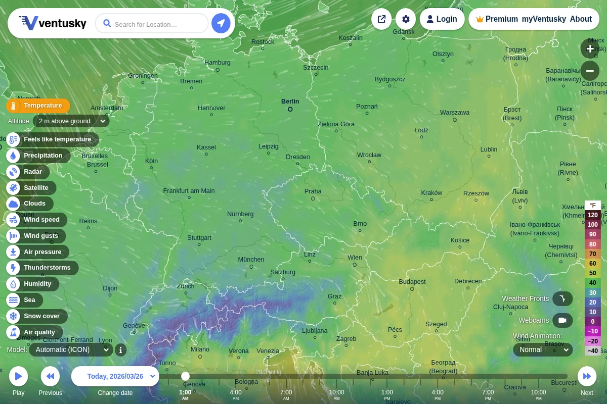
Ventusky - Interactive Global Weather Visualization
Ventusky transforms weather data into a mesmerizing visual experience that makes atmospheric science accessible to everyone. This Czech-developed platform combines multiple global weather models with fluid animations that show wind patterns, precipitation, and temperature changes flowing across the planet in real-time. The interface feels more like exploring a living artwork than consulting a traditional weather forecast.
What sets Ventusky apart is its comprehensive approach to meteorological visualization. Users can dive deep into atmospheric layers, examining conditions from sea level up to 100,000 feet, switching between different forecast models like ICON, GFS, and ECMWF, and exploring specialized parameters including air quality, thunderstorm activity, and even snow cover. The platform’s wind animations are particularly captivating, revealing the invisible currents that shape our weather patterns.
...
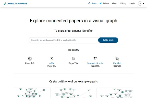
Connected Papers transforms the often overwhelming landscape of academic research into intuitive visual networks that reveal the hidden connections between scholarly works. By entering a paper identifier—whether DOI, arXiv URL, or title—researchers can generate interactive graphs that map citation relationships and thematic similarities across their field of interest.
The platform excels at making complex academic relationships tangible through its graph-based visualization. Each node represents a paper, while connections illustrate citation patterns, co-citations, and bibliographic coupling. This approach proves invaluable for newcomers trying to understand an unfamiliar field, seasoned researchers ensuring they haven’t missed crucial works, or graduate students building comprehensive bibliographies for their theses.
...
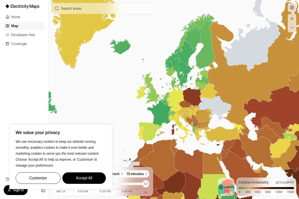
Electricity Maps - Real-Time Global Carbon Emissions
Electricity Maps transforms the invisible world of power generation into a stunning visual experience, revealing the environmental impact of our electricity consumption in real-time. This remarkable platform maps the carbon intensity of electrical grids across the globe, painting countries in different shades that correspond to how much CO₂ equivalent is emitted per kilowatt-hour of electricity produced.
What makes this tool extraordinary is its live data approach. Rather than relying on static statistics, the platform continuously updates to show how renewable energy sources like wind, solar, and hydroelectric power are actively reducing emissions throughout the day. You can watch as countries shift from dirty brown hues to cleaner greens when solar panels kick in during daylight hours or wind farms ramp up production.
...
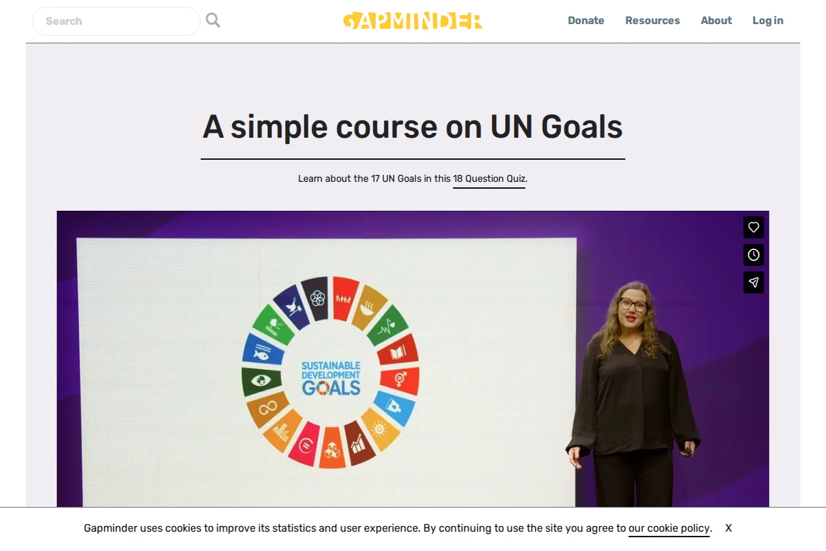
Gapminder - Fighting Global Misconceptions with Data
Gapminder represents one of the most compelling efforts to combat ignorance about global trends through data-driven education. This Swedish non-profit foundation, co-founded by the late Hans Rosling, has made it their mission to fight what they call “devastating misconceptions” about everything from extreme poverty and migration to climate change and global health.
What sets Gapminder apart is their methodical approach to identifying and correcting these misconceptions. They systematically survey thousands of people across different countries, asking fact-based questions about global trends, then compare the responses to actual UN and other reliable data sources. The results are consistently sobering — people are wrong about nearly everything, often dramatically so. Their Worldview Upgrader tool transforms this research into an engaging quiz that reveals just how skewed our perceptions of reality can be.
...