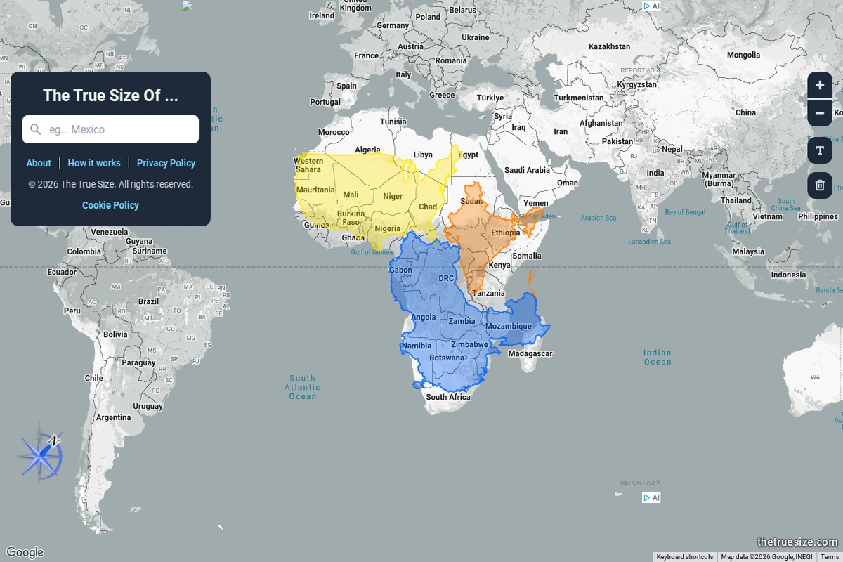
Most of us grew up with world maps that quietly lied to us. The Mercator projection — ubiquitous in classrooms, atlases, and Google Maps alike — dramatically inflates the size of landmasses near the poles while compressing those near the equator. The result is a deeply skewed mental model of the world: Greenland looks comparable to Africa, Alaska dwarfs Brazil, and Europe seems far larger than it actually is relative to Sub-Saharan countries.\n\nThe True Size Of… exists to correct that intuition in the most direct way possible. You type in the name of any country, and a coloured silhouette of it appears on the map — one that you can then drag freely across the globe. As you move it toward the poles or back toward the equator, the shape dynamically adjusts to reflect the Mercator distortion at that latitude, letting you place countries side by side for an honest comparison. The screenshot above shows exactly this: multiple African nations stacked together, revealing that the continent dwarfs what standard maps imply.\n\nWhat makes this tool so effective is its elegant simplicity. There are no tutorials required, no data tables to parse — just drag, compare, and feel the quiet shock of realising how profoundly cartographic convention has shaped your worldview. Africa, it turns out, is large enough to swallow the contiguous United States, China, India, and most of Europe simultaneously. That’s not a fun fact — it’s a correction to a decades-long optical illusion baked into our education.\n\nBeyond the “wow” moment, the site works as a genuinely useful research and teaching tool. Geography teachers, journalists, and anyone working with spatial data will find it indispensable for building accurate mental models of scale. It supports multiple languages and runs entirely in the browser, requiring nothing beyond a curiosity about the world’s actual shape.\n\n🔗 thetruesize.com
The True Size Of… — Country Size Comparator