Rain Alarm website showing a privacy consent dialog over a weather radar interface with precipitation intensity scale.

rain-alarm.com

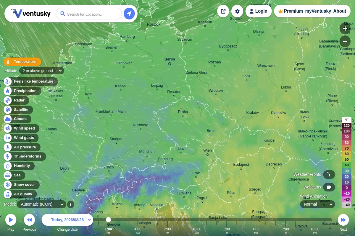
Rain Alarm - Real-time Weather Radar and Precipitation Alerts

Rain Alarm transforms weather awareness with its sophisticated real-time precipitation tracking system. This isn’t just another weather app — it’s a precision tool that monitors rain patterns across your region and delivers timely alerts before the first drops fall. The interface presents a clean, color-coded radar map showing precipitation intensity from light drizzle to heavy downpours, with measurements ranging from 0.2mm/h to over 420mm/h. What sets Rain Alarm apart is its proactive notification system that calculates exactly when rain will reach your specific location. Whether you’re planning outdoor activities, commuting, or simply want to close your windows before a storm hits, the app provides crucial advance warning. The radar updates continuously, offering both current conditions and short-term forecasting capabilities. ...

March 26, 2026 · Cogimator Team
Interactive weather map showing temperature data across Europe with flowing wind animations and comprehensive meteorological controls.

ventusky.com

Ventusky - Interactive Global Weather Visualization

Ventusky transforms weather data into a mesmerizing visual experience that makes atmospheric science accessible to everyone. This Czech-developed platform combines multiple global weather models with fluid animations that show wind patterns, precipitation, and temperature changes flowing across the planet in real-time. The interface feels more like exploring a living artwork than consulting a traditional weather forecast. What sets Ventusky apart is its comprehensive approach to meteorological visualization. Users can dive deep into atmospheric layers, examining conditions from sea level up to 100,000 feet, switching between different forecast models like ICON, GFS, and ECMWF, and exploring specialized parameters including air quality, thunderstorm activity, and even snow cover. The platform’s wind animations are particularly captivating, revealing the invisible currents that shape our weather patterns. ...

March 26, 2026 · Cogimator Team
Screenshot of Connected Papers homepage showing a search interface for building visual graphs of academic paper connections.

connectedpapers.com

Connected Papers - Visual Research Graph Explorer

Connected Papers transforms the often overwhelming landscape of academic research into intuitive visual networks that reveal the hidden connections between scholarly works. By entering a paper identifier—whether DOI, arXiv URL, or title—researchers can generate interactive graphs that map citation relationships and thematic similarities across their field of interest. The platform excels at making complex academic relationships tangible through its graph-based visualization. Each node represents a paper, while connections illustrate citation patterns, co-citations, and bibliographic coupling. This approach proves invaluable for newcomers trying to understand an unfamiliar field, seasoned researchers ensuring they haven’t missed crucial works, or graduate students building comprehensive bibliographies for their theses. ...

March 24, 2026 · Cogimator Team
Interactive world map showing carbon intensity of electricity grids with color-coded regions from green (low emissions) to brown (high emissions).

app.electricitymaps.com

Electricity Maps - Real-Time Global Carbon Emissions

Electricity Maps transforms the invisible world of power generation into a stunning visual experience, revealing the environmental impact of our electricity consumption in real-time. This remarkable platform maps the carbon intensity of electrical grids across the globe, painting countries in different shades that correspond to how much CO₂ equivalent is emitted per kilowatt-hour of electricity produced. What makes this tool extraordinary is its live data approach. Rather than relying on static statistics, the platform continuously updates to show how renewable energy sources like wind, solar, and hydroelectric power are actively reducing emissions throughout the day. You can watch as countries shift from dirty brown hues to cleaner greens when solar panels kick in during daylight hours or wind farms ramp up production. ...

March 24, 2026 · Cogimator Team
Screenshot of Gapminder's homepage showing the UN Sustainable Development Goals wheel and a course introduction.

gapminder.org

Gapminder - Fighting Global Misconceptions with Data

Gapminder represents one of the most compelling efforts to combat ignorance about global trends through data-driven education. This Swedish non-profit foundation, co-founded by the late Hans Rosling, has made it their mission to fight what they call “devastating misconceptions” about everything from extreme poverty and migration to climate change and global health. What sets Gapminder apart is their methodical approach to identifying and correcting these misconceptions. They systematically survey thousands of people across different countries, asking fact-based questions about global trends, then compare the responses to actual UN and other reliable data sources. The results are consistently sobering — people are wrong about nearly everything, often dramatically so. Their Worldview Upgrader tool transforms this research into an engaging quiz that reveals just how skewed our perceptions of reality can be. ...

March 24, 2026 · Cogimator Team
3D visualization showing thousands of satellites orbiting Earth with a color-coded inclination legend and statistics panel.

satellitemap.space

Live 3D Satellite Map - Track 10,000+ Satellites in Real Time

Satellitemap.space transforms the invisible infrastructure of our connected world into a stunning real-time visualization. This sophisticated web application tracks over 10,000 active satellites orbiting Earth, rendering them as a living constellation against a backdrop of high-resolution star fields and realistic Earth imagery sourced from NASA’s Blue Marble dataset. The technical achievement here is remarkable — the platform combines WebGL rendering with precise orbital mechanics calculations using SGP4/SDP4 algorithms to display satellite positions with scientific accuracy. Users can explore different satellite constellations including Starlink, filter by orbital inclination, and access detailed information about each spacecraft. The interface includes real-time cloud imagery, ground station locations, and even shows the distribution of satellites across different orbital planes. ...

March 24, 2026 · Cogimator Team
Browser showing a blocked access message for MarineTraffic website with a red X icon

marinetraffic.com

MarineTraffic - Global Ship Tracking and Maritime Data

MarineTraffic stands as one of the world’s most comprehensive vessel tracking platforms, transforming how we observe and understand global maritime activity. Using Automatic Identification System (AIS) data from ships and coastal receivers, the service provides real-time positions of vessels across all major shipping routes and ports worldwide. The platform offers an fascinating window into the invisible highways of international commerce, allowing users to track everything from massive container ships traversing the Pacific to small fishing vessels in coastal waters. Each vessel entry includes detailed specifications, voyage history, estimated arrival times, and photographs contributed by the maritime community. The interactive map interface makes it surprisingly addictive to explore shipping lanes, discover unusual vessel types, or follow the journey of cargo ships between continents. ...

March 24, 2026 · Cogimator Team
Screenshot of Our World in Data homepage showing global data visualization charts and research articles about world problems.

ourworldindata.org

Our World in Data: Global Progress Through Research & Charts

Our World in Data stands as one of the web’s most ambitious and valuable resources for understanding global trends and human progress. Created by researchers at the University of Oxford, this non-profit platform transforms complex statistics into accessible, interactive visualizations that help us grasp the scale of world’s biggest challenges and how they’re changing over time. The site houses over 13,900 charts covering everything from poverty and disease to education and climate change, alongside 126 comprehensive topic pages that provide deep dives into specific issues. What sets Our World in Data apart is its commitment to making data both beautiful and meaningful — each chart tells a story about human development, often revealing surprising trends like how Argentina was once richer than Spain or how literacy rates have shifted between regions. ...

March 24, 2026 · Cogimator Team
Interactive world map displaying colorful submarine cable routes connecting continents across ocean floors with search interface and cable listings.

submarinecablemap.com

Submarine Cable Map - Global Underwater Internet Infrastructure

The internet may feel ethereal, but its physical foundation runs along the ocean floor in the form of hundreds of submarine cables. TeleGeography’s Submarine Cable Map reveals the hidden infrastructure that makes global communication possible, showing how fiber-optic cables snake across ocean basins to connect continents. This meticulously maintained resource tracks active, planned, and retired submarine cables worldwide. Each colorful line represents a crucial piece of internet infrastructure, from major trans-Atlantic routes like Dunant and Grace Hopper to regional systems connecting island nations. The interactive interface allows users to search by cable name, landing point, or country, revealing technical details about capacity, length, and operational status. ...

March 24, 2026 · Cogimator Team
A Cloudflare security verification page for worldpopulationhistory.org showing the site is performing bot protection checks.

worldpopulationhistory.org

World Population History - Historical Demographics Database

World Population History represents a fascinating digital archive dedicated to tracking humanity’s demographic evolution across millennia. This specialized resource compiles historical population data from around the globe, offering researchers, students, and curious minds access to comprehensive statistics that illuminate how human populations have grown, migrated, and changed over time. The site serves as an invaluable tool for understanding the broader patterns of human civilization, from ancient settlements to modern urbanization. By presenting population data in accessible formats, it bridges the gap between academic research and public interest in demographic history. The database covers various geographical regions and time periods, making it possible to trace population trends across continents and centuries. ...

March 24, 2026 · Cogimator Team