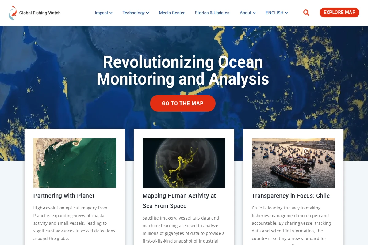
Portfolio homepage showing three featured projects: historical printing types, astronomical diagrams, and a railroad organizational chart.

c82.net

C82: Nicholas Rougeux's Data Art & Historical Recreations

Nicholas Rougeux has carved out a fascinating niche at the intersection of data visualization and historical preservation. This Midwest-based artist specializes in creating meticulous digital recreations of vintage scientific illustrations, organizational charts, and educational materials that might otherwise be forgotten to time. His portfolio showcases an impressive range of projects, from the intricate astronomical diagrams of Thomas Wright’s 1742 Clavis Cælestis to the elaborate typography specimens in Daniel Updike’s printing guide. Each project represents months of painstaking research and reconstruction work. Rougeux doesn’t simply scan or photograph these historical documents—he rebuilds them from scratch, often spending considerable time hunting down source materials and understanding their original context. ...

March 27, 2026 · Cogimator Team
Screenshot of Harvard's Atlas of Economic Complexity homepage showing a globe visualization and sections for trade dynamics and country profiles.

atlas.hks.harvard.edu

Atlas of Economic Complexity - Harvard Growth Lab

The Atlas of Economic Complexity represents one of the most sophisticated attempts to map and understand the intricate web of global economic relationships. Developed by Harvard’s Growth Lab, this remarkable platform transforms decades of trade data into compelling visual narratives that reveal how countries develop their productive capabilities over time. At its core, the Atlas employs the concept of economic complexity — the idea that a country’s economic sophistication can be measured by the diversity and uniqueness of its exports. Through stunning interactive visualizations, users can explore trade dynamics, country profiles, and growth projections that span more than half a century. The platform’s product space visualizations are particularly striking, showing how different products cluster together based on the capabilities required to produce them. ...

March 26, 2026 · Cogimator Team
Interactive globe showing real-time wind patterns as flowing green particles across Earth's continents and oceans.

earth.nullschool.net

Earth: Real-time Global Wind and Weather Visualization

Earth transforms complex meteorological data into one of the most beautiful and intuitive weather visualizations ever created. This interactive globe displays real-time wind patterns, ocean currents, temperature gradients, and atmospheric conditions through flowing animated particles that dance across the planet’s surface. The result is both scientifically accurate and visually stunning — watching storm systems swirl or trade winds flow becomes an almost meditative experience. The project, created by Cameron Beccario, sources data from multiple meteorological organizations including NOAA, updating every three hours to maintain accuracy. Users can explore different atmospheric layers, from surface winds to jet streams at 250 hPa, and switch between various weather parameters including temperature, humidity, and precipitation. The smooth WebGL rendering ensures the visualization runs beautifully on modern browsers while maintaining scientific precision. ...

March 26, 2026 · Cogimator Team
Rain Alarm website showing a privacy consent dialog over a weather radar interface with precipitation intensity scale.

rain-alarm.com

Rain Alarm - Real-time Weather Radar and Precipitation Alerts

Rain Alarm transforms weather awareness with its sophisticated real-time precipitation tracking system. This isn’t just another weather app — it’s a precision tool that monitors rain patterns across your region and delivers timely alerts before the first drops fall. The interface presents a clean, color-coded radar map showing precipitation intensity from light drizzle to heavy downpours, with measurements ranging from 0.2mm/h to over 420mm/h. What sets Rain Alarm apart is its proactive notification system that calculates exactly when rain will reach your specific location. Whether you’re planning outdoor activities, commuting, or simply want to close your windows before a storm hits, the app provides crucial advance warning. The radar updates continuously, offering both current conditions and short-term forecasting capabilities. ...

March 26, 2026 · Cogimator Team
Interactive weather map showing temperature data across Europe with flowing wind animations and comprehensive meteorological controls.

ventusky.com

Ventusky - Interactive Global Weather Visualization

Ventusky transforms weather data into a mesmerizing visual experience that makes atmospheric science accessible to everyone. This Czech-developed platform combines multiple global weather models with fluid animations that show wind patterns, precipitation, and temperature changes flowing across the planet in real-time. The interface feels more like exploring a living artwork than consulting a traditional weather forecast. What sets Ventusky apart is its comprehensive approach to meteorological visualization. Users can dive deep into atmospheric layers, examining conditions from sea level up to 100,000 feet, switching between different forecast models like ICON, GFS, and ECMWF, and exploring specialized parameters including air quality, thunderstorm activity, and even snow cover. The platform’s wind animations are particularly captivating, revealing the invisible currents that shape our weather patterns. ...

March 26, 2026 · Cogimator Team
Screenshot of Connected Papers homepage showing a search interface for building visual graphs of academic paper connections.

connectedpapers.com

Connected Papers - Visual Research Graph Explorer

Connected Papers transforms the often overwhelming landscape of academic research into intuitive visual networks that reveal the hidden connections between scholarly works. By entering a paper identifier—whether DOI, arXiv URL, or title—researchers can generate interactive graphs that map citation relationships and thematic similarities across their field of interest. The platform excels at making complex academic relationships tangible through its graph-based visualization. Each node represents a paper, while connections illustrate citation patterns, co-citations, and bibliographic coupling. This approach proves invaluable for newcomers trying to understand an unfamiliar field, seasoned researchers ensuring they haven’t missed crucial works, or graduate students building comprehensive bibliographies for their theses. ...

March 24, 2026 · Cogimator Team
Interactive world map showing carbon intensity of electricity grids with color-coded regions from green (low emissions) to brown (high emissions).

app.electricitymaps.com

Electricity Maps - Real-Time Global Carbon Emissions

Electricity Maps transforms the invisible world of power generation into a stunning visual experience, revealing the environmental impact of our electricity consumption in real-time. This remarkable platform maps the carbon intensity of electrical grids across the globe, painting countries in different shades that correspond to how much CO₂ equivalent is emitted per kilowatt-hour of electricity produced. What makes this tool extraordinary is its live data approach. Rather than relying on static statistics, the platform continuously updates to show how renewable energy sources like wind, solar, and hydroelectric power are actively reducing emissions throughout the day. You can watch as countries shift from dirty brown hues to cleaner greens when solar panels kick in during daylight hours or wind farms ramp up production. ...

March 24, 2026 · Cogimator Team
Screenshot of Gapminder's homepage showing the UN Sustainable Development Goals wheel and a course introduction.

gapminder.org

Gapminder - Fighting Global Misconceptions with Data

Gapminder represents one of the most compelling efforts to combat ignorance about global trends through data-driven education. This Swedish non-profit foundation, co-founded by the late Hans Rosling, has made it their mission to fight what they call “devastating misconceptions” about everything from extreme poverty and migration to climate change and global health. What sets Gapminder apart is their methodical approach to identifying and correcting these misconceptions. They systematically survey thousands of people across different countries, asking fact-based questions about global trends, then compare the responses to actual UN and other reliable data sources. The results are consistently sobering — people are wrong about nearly everything, often dramatically so. Their Worldview Upgrader tool transforms this research into an engaging quiz that reveals just how skewed our perceptions of reality can be. ...

March 24, 2026 · Cogimator Team
3D visualization showing thousands of satellites orbiting Earth with a color-coded inclination legend and statistics panel.

satellitemap.space

Live 3D Satellite Map - Track 10,000+ Satellites in Real Time

Satellitemap.space transforms the invisible infrastructure of our connected world into a stunning real-time visualization. This sophisticated web application tracks over 10,000 active satellites orbiting Earth, rendering them as a living constellation against a backdrop of high-resolution star fields and realistic Earth imagery sourced from NASA’s Blue Marble dataset. The technical achievement here is remarkable — the platform combines WebGL rendering with precise orbital mechanics calculations using SGP4/SDP4 algorithms to display satellite positions with scientific accuracy. Users can explore different satellite constellations including Starlink, filter by orbital inclination, and access detailed information about each spacecraft. The interface includes real-time cloud imagery, ground station locations, and even shows the distribution of satellites across different orbital planes. ...

March 24, 2026 · Cogimator Team
Browser showing a blocked access message for MarineTraffic website with a red X icon

marinetraffic.com

MarineTraffic - Global Ship Tracking and Maritime Data

MarineTraffic stands as one of the world’s most comprehensive vessel tracking platforms, transforming how we observe and understand global maritime activity. Using Automatic Identification System (AIS) data from ships and coastal receivers, the service provides real-time positions of vessels across all major shipping routes and ports worldwide. The platform offers an fascinating window into the invisible highways of international commerce, allowing users to track everything from massive container ships traversing the Pacific to small fishing vessels in coastal waters. Each vessel entry includes detailed specifications, voyage history, estimated arrival times, and photographs contributed by the maritime community. The interactive map interface makes it surprisingly addictive to explore shipping lanes, discover unusual vessel types, or follow the journey of cargo ships between continents. ...

March 24, 2026 · Cogimator Team