Screenshot of Information is Beautiful website showing colorful data visualizations and training workshop announcements.

informationisbeautiful.net

Information is Beautiful - Data Visualization Collective

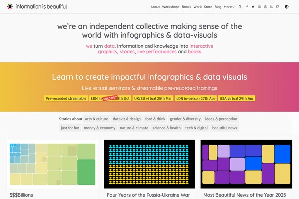
Information is Beautiful stands as one of the web’s most celebrated data visualization collectives, transforming complex information into stunning visual narratives that make sense of our world. Founded by David McCandless, this independent team has mastered the art of distilling data, information, and knowledge into beautiful infographics that are both educational and deeply engaging. The site showcases an impressive range of interactive graphics covering everything from the Russia-Ukraine war’s financial impact to vaccine misinformation, climate data, and even “beautiful news” compilations that highlight positive global trends. Each visualization demonstrates meticulous research and thoughtful design, turning potentially dry statistics into compelling stories that resonate with viewers. The collective doesn’t just present data — they craft experiences that help audiences understand complex topics through visual storytelling. ...

March 22, 2026 · Cogimator Team
An interactive map visualization showing Reddit communities as colored territories arranged geographically based on user overlap patterns.

anvaka.github.io/map-of-reddit

Interactive Map of Reddit Communities

This remarkable data visualization transforms Reddit’s vast ecosystem of communities into an interactive geographical map, where each subreddit becomes a territory with borders, neighbors, and relative sizes. Created by Andrei Kashcha, this project maps over 8,000 subreddits based on user overlap patterns, creating a landscape where similar communities naturally cluster together. The visualization reveals fascinating insights about Reddit’s social geography. Gaming communities form their own continent, while political subreddits create distinct regions that rarely overlap. Science and technology forums cluster in their own neighborhoods, and niche hobby communities form small islands connected by bridges of shared interests. The size of each territory reflects the community’s activity level, while the proximity indicates how much users move between related subreddits. ...

March 22, 2026 · Cogimator Team
LivePlasma homepage showing an interactive network visualization with connected nodes representing musical artists and a search interface.

liveplasma.com

LivePlasma - Musical Discovery Through Interactive Maps

LivePlasma transforms music discovery into a visual journey through interconnected networks of artists and influences. This innovative platform takes your musical preferences as a starting point and generates an interactive map showing related artists, creating pathways to new discoveries based on sonic similarities, collaborations, and cultural connections. The interface presents music as a living ecosystem where artists exist as nodes in a vast network, connected by invisible threads of influence and similarity. Users can search for any artist they love and watch as the system unfolds a web of related musicians, each connection representing a potential new favorite. The visual approach makes browsing feel more like exploration than traditional list-based recommendations. ...

March 22, 2026 · Cogimator Team
Homepage of Seeing Theory showing a circular arrangement of colorful dots around the title and subtitle describing it as a visual introduction to probability and statistics.

seeing-theory.brown.edu

Seeing Theory: Visual Introduction to Statistics

Seeing Theory transforms the often intimidating world of statistics into an engaging visual journey. Created by Daniel Kunin during his undergraduate years at Brown University, this remarkable educational platform demonstrates how interactive design can make complex mathematical concepts genuinely accessible to learners at all levels. The project covers six comprehensive chapters, from basic probability through advanced topics like Bayesian inference and regression analysis. Each concept is brought to life through carefully crafted D3.js visualizations that allow users to manipulate parameters and observe real-time changes in statistical distributions, probability outcomes, and data relationships. The platform’s strength lies in its ability to make abstract mathematical relationships tangible and intuitive. ...

March 22, 2026 · Cogimator Team
Preview of the Every Noise at Once website

everynoise.com

Every Noise at Once – explore the entire world of music on one sound map

Every Noise at Once is a vast interactive map of musical genres, generated from Spotify’s massive data trove. Hundreds of genres are plotted based on sonic similarity. Click on any genre to hear an audio sample or dive into representative artists. The site allows you to discover not only mainstream styles but also obscure microgenres you’ve likely never heard of. It’s a true voyage through the sonic universe – surprising, inspiring, and completely addictive. Perfect for music geeks and anyone curious about new sounds. ...

July 26, 2025 · Cogimator Team
Screenshot of the Gwern.net website

www.gwern.net

Gwern.net – a personal encyclopedia of research and speculation

Gwern.net is a personal, long-running research site by Gwern Branwen, an independent writer and self-taught researcher. The website gathers a vast collection of long-form essays, scientific explorations, experiments, and data analyses — spanning cognitive psychology, artificial intelligence, Bayesian inference, nootropics, digital preservation, literature generation, and more. Since 2010, Gwern has been publishing rigorously documented articles, often including full datasets, code (typically in Python or R), and interactive elements. The tone is scholarly but accessible, blending speculative ideas with solid methodology. Many entries are live documents, continuously updated as new research emerges. ...

July 26, 2025 · Cogimator Team
Preview of Zoom Earth – satellite data of cloud coverage

zoom.earth

Zoom Earth – watch near real-time satellite imagery of Earth

Zoom Earth is an interactive satellite map that displays near real-time weather data from NASA, NOAA, and Blue Marble. View global cloud formations, track hurricanes and typhoons, follow wildfires, and explore ocean temperature anomalies – all in one interface. With frequent updates and high visual fidelity, it’s a must-have for weather enthusiasts, travelers, educators, and curious explorers of our living planet. 🔗 zoom.earth

July 26, 2025 · Cogimator Team