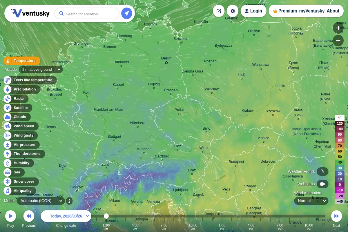
Ventusky - Interactive Global Weather Visualization
Ventusky transforms weather data into a mesmerizing visual experience that makes atmospheric science accessible to everyone. This Czech-developed platform combines multiple global weather models with fluid animations that show wind patterns, precipitation, and temperature changes flowing across the planet in real-time. The interface feels more like exploring a living artwork than consulting a traditional weather forecast. What sets Ventusky apart is its comprehensive approach to meteorological visualization. Users can dive deep into atmospheric layers, examining conditions from sea level up to 100,000 feet, switching between different forecast models like ICON, GFS, and ECMWF, and exploring specialized parameters including air quality, thunderstorm activity, and even snow cover. The platform’s wind animations are particularly captivating, revealing the invisible currents that shape our weather patterns. ...