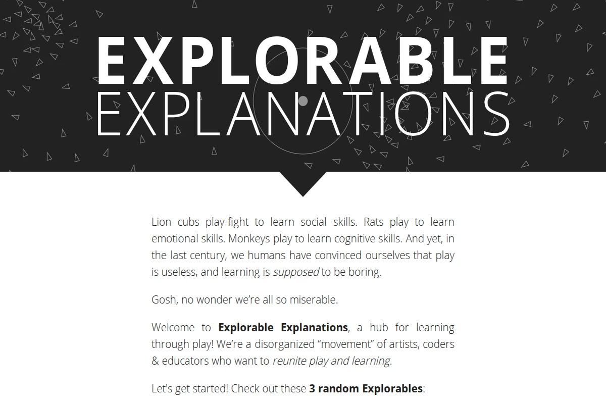
The bold black-and-white homepage of Explorable Explanations, featuring large typographic lettering and scattered triangle shapes.

explorabl.es

Explorable Explanations – Learn by Playing

What if learning felt less like a lecture and more like play? That’s the animating question behind Explorable Explanations, a community-built hub that collects interactive essays, simulations, and toys spanning an impressive range of subjects — mathematics, physics, biology, journalism, philosophy, and more. The site opens with a disarming manifesto: lion cubs play-fight to learn social skills, rats play to acquire emotional ones, monkeys learn cognition through play — and yet humans have somehow convinced themselves that learning is supposed to be boring. The point lands.\n\nThe “explorables” themselves are the real draw. Rather than static text or passive video, each piece invites you to drag sliders, poke simulations, and observe systems changing in real time. A tutorial on trigonometry teaches by letting you aim a homing rocket. A piece on 4D geometry hands you an actual toy for “4D children.” The format, pioneered by thinkers like Bret Victor, turns explanation into a genuine dialogue between reader and idea.\n\nThe site is deliberately described as a “disorganized movement” — a loose collective of artists, coders, and educators rather than a polished institution. That roughness is part of its charm. You can browse by subject, hit a button for three random explorables, or simply view everything on a single sprawling page. The source code is open (“open sauce,” as they put it), and the community extends onto Reddit and social media for those who want to contribute their own interactive work.\n\nFor anyone who has ever felt that a diagram would be better if you could touch it, or that an equation might click if you could just play with it, Explorable Explanations is an essential bookmark. It is simultaneously a gallery, a toolkit, and a quiet argument for a better way of teaching.\n\n🔗 explorabl.es ...

July 18, 2026 · Cogimator Team
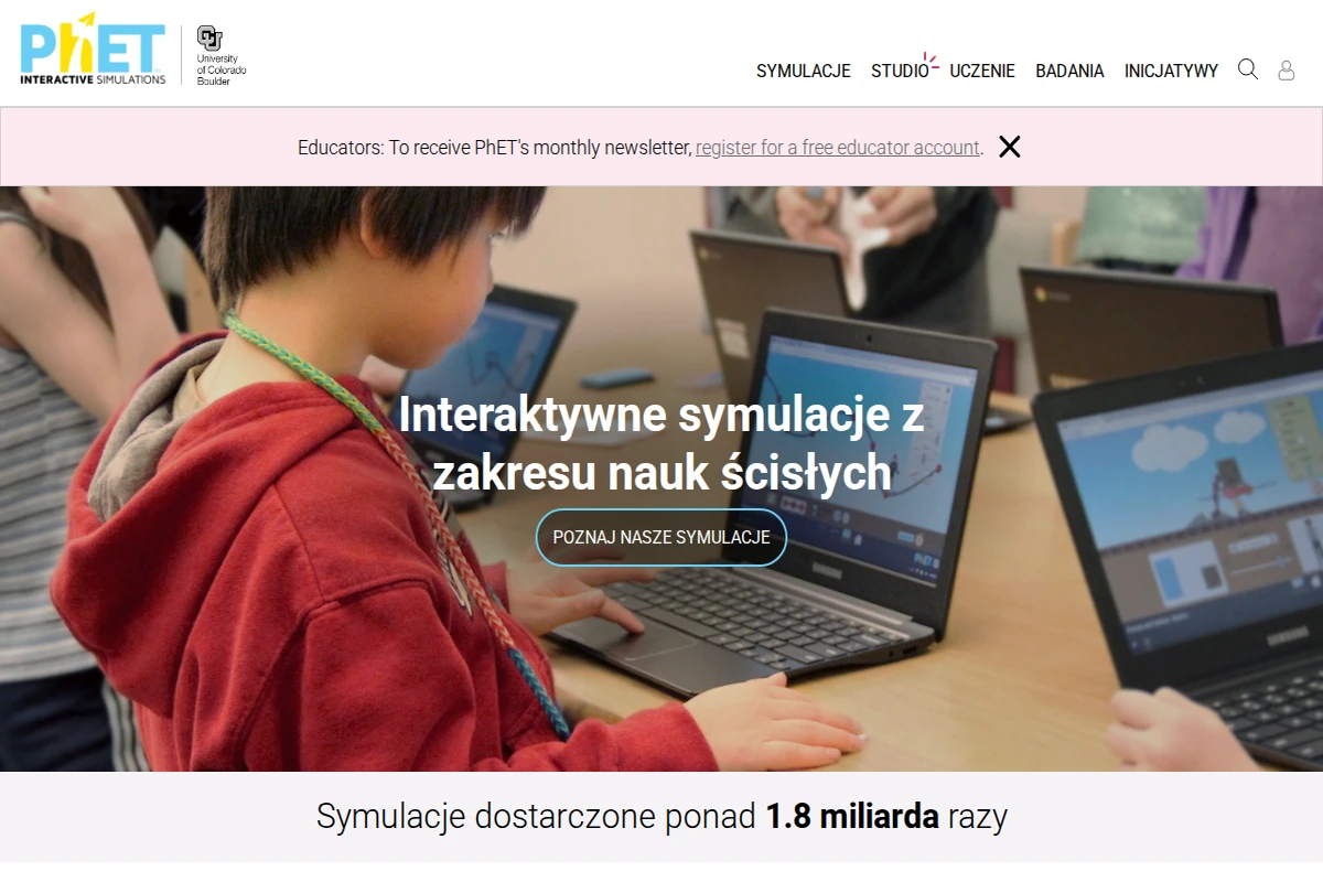
A child using a laptop in a classroom with PhET interactive science simulations visible on screen.

phet.colorado.edu/pl

PhET Interactive Simulations – Free Science & Math Sims

PhET Interactive Simulations is one of the most ambitious and genuinely impactful educational projects on the web. Born in 2002 at the University of Colorado Boulder under the guidance of Nobel Prize-winning physicist Carl Wieman, it set out to answer a deceptively simple question: what if students could play their way into understanding science? Two decades and 1.8 billion simulation runs later, the answer is resoundingly yes.\n\nThe library spans 173 simulations across physics, mathematics and statistics, chemistry, earth science, and biology — all free, all browser-based, and available in 132 languages. Each simulation is built on a foundation of rigorous education research, designed so that learners discover principles through hands-on experimentation rather than passive reading. You can drag electrons around a circuit, watch probability distributions emerge in real time, or manipulate molecules and immediately see how intermolecular forces change. The interface feels closer to a well-designed game than a textbook exercise.\n\nFor educators, PhET goes well beyond just providing tools. The platform hosts over 3,600 teacher-contributed lesson plans, simulation-specific teaching guides, introductory videos, and professional development workshops. A dedicated Studio tier even allows teachers to create customised versions of simulations tailored to specific classroom needs — a rare and thoughtful addition.\n\nWhat makes PhET stand out among educational platforms is its commitment to inclusive design and accessibility. The team actively works on making simulations usable with screen readers and assistive technologies, and the project has a dedicated initiative around diversity, equity, inclusion, and belonging in STEM education. The source code is open, translations are community-driven, and offline access is supported — making PhET genuinely global in reach, not just in aspiration.\n\n🔗 phet.colorado.edu ...

July 18, 2026 · Cogimator Team
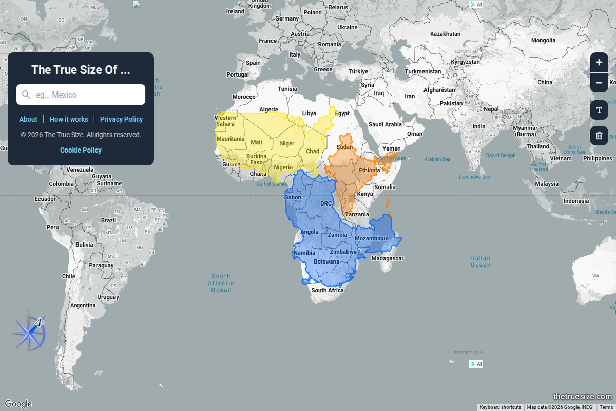
An interactive world map showing multiple African countries dragged into the same view, colour-coded to reveal their true comparative sizes under Mercator projection.

thetruesize.com

The True Size Of… — Country Size Comparator

Most of us grew up with world maps that quietly lied to us. The Mercator projection — ubiquitous in classrooms, atlases, and Google Maps alike — dramatically inflates the size of landmasses near the poles while compressing those near the equator. The result is a deeply skewed mental model of the world: Greenland looks comparable to Africa, Alaska dwarfs Brazil, and Europe seems far larger than it actually is relative to Sub-Saharan countries.\n\nThe True Size Of… exists to correct that intuition in the most direct way possible. You type in the name of any country, and a coloured silhouette of it appears on the map — one that you can then drag freely across the globe. As you move it toward the poles or back toward the equator, the shape dynamically adjusts to reflect the Mercator distortion at that latitude, letting you place countries side by side for an honest comparison. The screenshot above shows exactly this: multiple African nations stacked together, revealing that the continent dwarfs what standard maps imply.\n\nWhat makes this tool so effective is its elegant simplicity. There are no tutorials required, no data tables to parse — just drag, compare, and feel the quiet shock of realising how profoundly cartographic convention has shaped your worldview. Africa, it turns out, is large enough to swallow the contiguous United States, China, India, and most of Europe simultaneously. That’s not a fun fact — it’s a correction to a decades-long optical illusion baked into our education.\n\nBeyond the “wow” moment, the site works as a genuinely useful research and teaching tool. Geography teachers, journalists, and anyone working with spatial data will find it indispensable for building accurate mental models of scale. It supports multiple languages and runs entirely in the browser, requiring nothing beyond a curiosity about the world’s actual shape.\n\n🔗 thetruesize.com ...

July 18, 2026 · Cogimator Team
Screenshot showing Worldometer's dashboard with real-time global statistics including world population counter and various data categories.

worldometers.info

Worldometer - Real-Time Global Statistics Dashboard

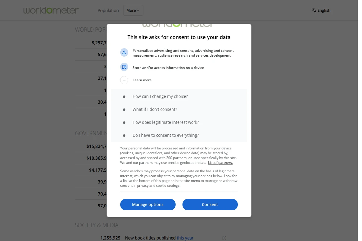
Worldometer stands as one of the internet’s most mesmerizing data experiences, offering real-time statistics that capture the pulse of our planet. This comprehensive dashboard transforms abstract global phenomena into tangible, constantly updating numbers that reveal the sheer scale of human activity and planetary processes. The site presents an extraordinary array of live counters covering everything from births and deaths to energy consumption, environmental changes, and technological production. Watching the world population tick upward by hundreds of thousands daily, or observing millions of Google searches accumulate by the minute, provides a visceral understanding of our interconnected world’s intensity and pace. ...

June 8, 2026 · Cogimator Team
A 3D visualization showing thousands of stars as colorful points against a black space background with navigation controls.

stars.chromeexperiments.com

Interactive 3D Star Map by Chrome Experiments

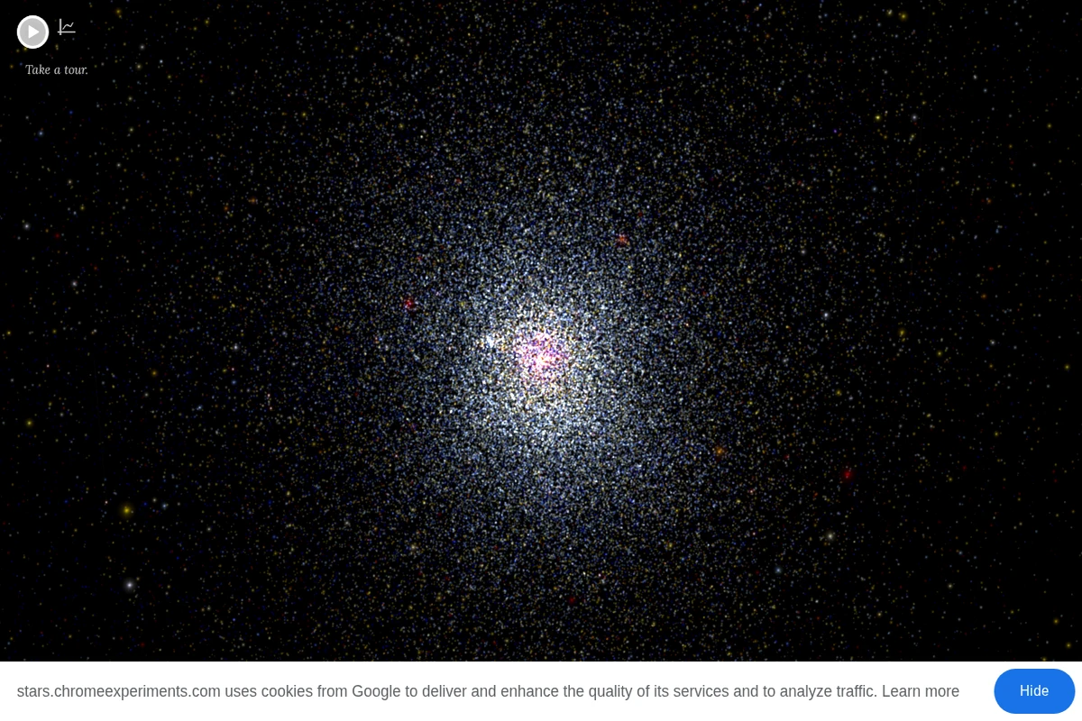
This remarkable Chrome Experiment transforms astronomical data into a breathtaking interactive journey through our cosmic neighborhood. The visualization presents thousands of stars positioned according to their actual three-dimensional coordinates in space, allowing visitors to navigate freely through the stellar landscape surrounding our solar system. What makes this experience particularly compelling is its scientific accuracy combined with intuitive exploration. Each star is positioned based on real astronomical data, including familiar names like Proxima Centauri, Sirius, Vega, and Betelgeuse. The interface encourages discovery through movement, letting you appreciate the true scale and structure of our local stellar environment in ways that traditional flat star charts simply cannot convey. ...

May 30, 2026 · Cogimator Team
Website showing a space station view with Earth visible through windows and text stating 'There are 13 humans in space'.

whoisinspace.com

Who Is in Space - Live Astronaut Tracker

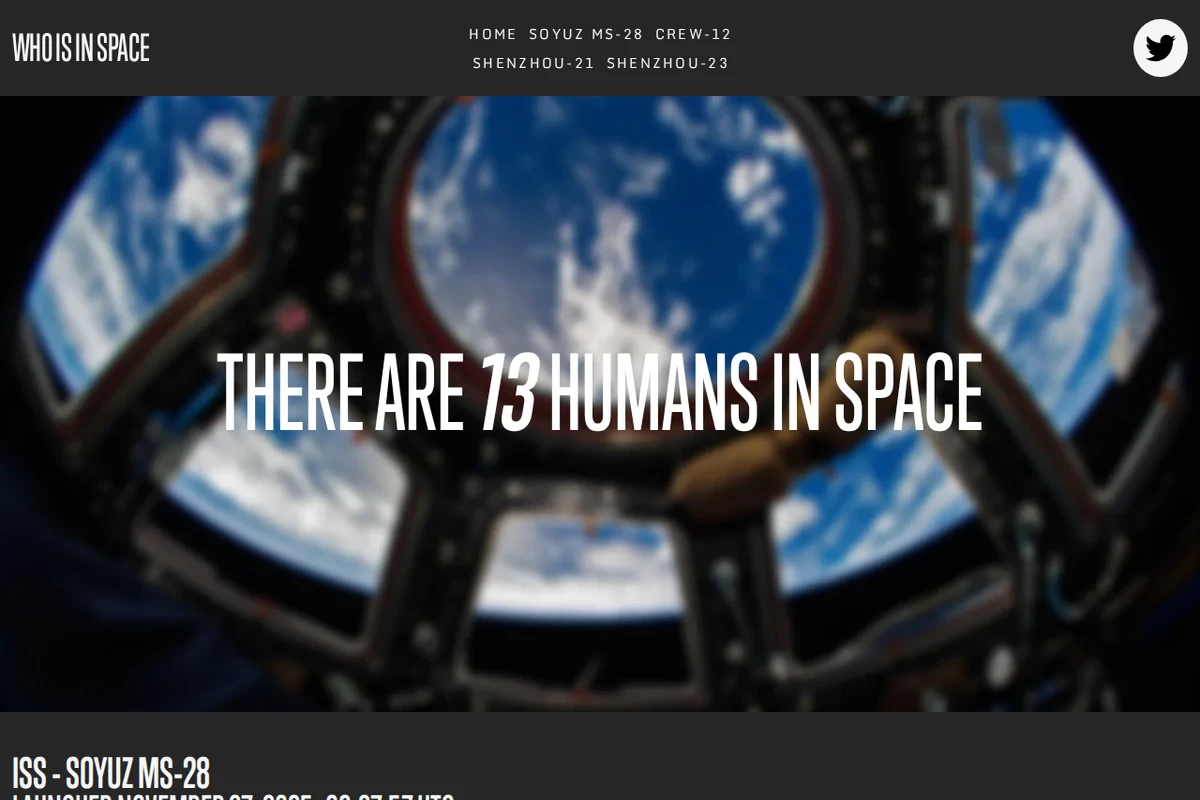
In an era where space travel is becoming increasingly routine, Who Is in Space serves as our celestial attendance sheet, tracking every human currently beyond Earth’s atmosphere. This elegantly simple website provides real-time information about astronauts and cosmonauts aboard the International Space Station, China’s Tiangong station, and other orbital outposts. Created by Destin Sandlin of the popular science YouTube channel Smarter Every Day, the site presents mission details with precision timing down to the second. Each crew member’s profile includes their current mission duration and total accumulated time in space, offering fascinating insights into the dedication required for space exploration. The clean interface displays launch dates, mission codes, and crew rotations across multiple space agencies. ...

May 30, 2026 · Cogimator Team
Screenshot showing World History Encyclopedia's homepage with privacy settings dialog and featured articles about ancient civilizations and historical topics.

worldhistory.org

World History Encyclopedia - Free Digital History Education

World History Encyclopedia stands as one of the web’s most ambitious educational projects, offering completely free access to meticulously researched historical content spanning from ancient Mesopotamia to modern times. This non-profit initiative has assembled an impressive collection of articles, definitions, images, and multimedia resources that rival traditional academic publishers in both scope and quality. What sets this encyclopedia apart is its commitment to accessibility without compromising scholarly rigor. Each article is thoroughly researched and written by historians, archaeologists, and subject matter experts, yet presented in language that serves both students and curious minds alike. The site covers fascinating topics ranging from ancient Sumerian poetry like “The World’s Oldest Love Poem” to colonial architecture and medieval political intrigue, demonstrating the interconnected nature of human civilization. ...

May 4, 2026 · Cogimator Team
Screenshot of Orb.Farm showing a pixelated aquatic ecosystem with a pink and purple spiral organism, various interface elements for adding materials and creatures, and environmental controls.

orb.farm

Orb.Farm - Digital Aquatic Ecosystem Simulator

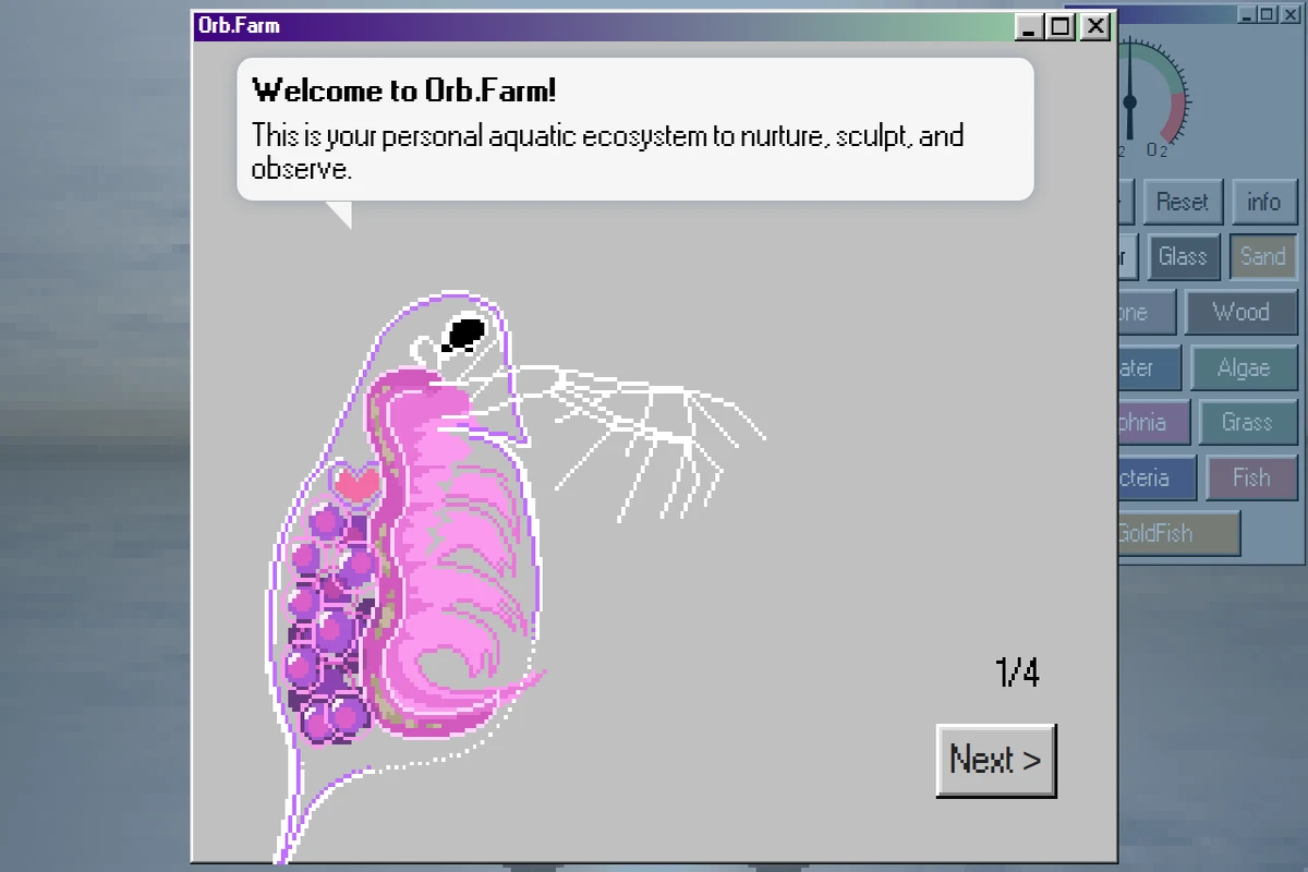
Orb.Farm presents a delightfully pixelated take on ecosystem simulation, inviting users to cultivate their own miniature aquatic worlds within a web browser. This charming digital terrarium combines the meditative qualities of fishkeeping with the experimental joy of building balanced ecosystems from scratch. The interface reveals itself as both intuitive and surprisingly deep, offering an array of biological and environmental elements to experiment with. Users can introduce fish, algae, bacteria, and daphnia into their virtual aquariums, then observe how these organisms interact, compete, and coexist. The addition of physical materials like sand, glass, wood, and stone allows for creative habitat design, while environmental controls for oxygen and CO2 levels add scientific depth to the experience. ...

April 13, 2026 · Cogimator Team
Screenshot showing FlowingData website with a blog post about Ziptable, a tool for sharing small datasets via URL, including data preview and compression interface.

flowingdata.com

FlowingData — Making Sense of Data Through Visualization

FlowingData stands as one of the most thoughtful and educational resources in the data visualization community, curated by statistician Nathan Yau. The site masterfully bridges the gap between technical expertise and accessible storytelling, offering both practical tools and deep insights into how data shapes our understanding of the world. What sets FlowingData apart is its blend of technical tutorials, real-world applications, and critical analysis of data visualization in media. From exploring presidential approval ratings against gas prices to mapping space missions with stunning 3D visualizations, the site demonstrates how effective data visualization can reveal patterns and tell compelling stories. The membership section provides access to in-depth tutorials and datasets, while the public content showcases excellent examples of data journalism and visualization techniques. ...

April 3, 2026 · Cogimator Team
Screenshot showing various world map cartograms including CO₂ emissions, olive production, and earthquake data with distorted country sizes.

worldmapper.org

Worldmapper - Data Visualization Through Cartograms

Worldmapper presents a fascinating alternative to conventional cartography by creating cartograms where countries and territories are resized according to specific data points rather than geographical area. This ingenious approach reveals patterns and relationships in global data that traditional maps often obscure. The platform offers an extensive collection of maps covering diverse topics from environmental data like CO₂ emissions per capita to cultural phenomena such as Wimbledon championship winners by country. Each cartogram transforms our familiar world map into something both alien and illuminating — countries might appear as tiny slivers or massive blobs depending on their relationship to the measured variable. ...

April 3, 2026 · Cogimator Team