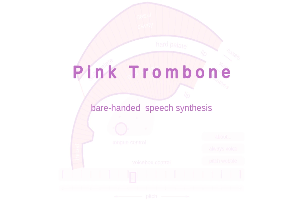
Screenshot of Harvard's Atlas of Economic Complexity homepage showing a globe visualization and sections for trade dynamics and country profiles.

atlas.hks.harvard.edu

Atlas of Economic Complexity - Harvard Growth Lab

The Atlas of Economic Complexity represents one of the most sophisticated attempts to map and understand the intricate web of global economic relationships. Developed by Harvard’s Growth Lab, this remarkable platform transforms decades of trade data into compelling visual narratives that reveal how countries develop their productive capabilities over time. At its core, the Atlas employs the concept of economic complexity — the idea that a country’s economic sophistication can be measured by the diversity and uniqueness of its exports. Through stunning interactive visualizations, users can explore trade dynamics, country profiles, and growth projections that span more than half a century. The platform’s product space visualizations are particularly striking, showing how different products cluster together based on the capabilities required to produce them. ...

March 26, 2026 · Cogimator Team
A security verification page for The Artifice website showing Cloudflare protection screen.

the-artifice.com

The Artifice - Literary & Cultural Analysis Platform

The Artifice stands as a beacon for thoughtful cultural criticism in the digital age, offering a platform where literature, film, television, and popular culture receive the serious analytical treatment they deserve. This online publication has carved out a distinctive niche by encouraging contributors to dig beneath surface-level entertainment value and explore the deeper currents that run through our cultural landscape. What sets The Artifice apart is its commitment to fostering genuine intellectual discourse around media that often gets dismissed as mere entertainment. The platform welcomes both established critics and emerging voices, creating a democratic space where insightful analysis can flourish regardless of academic credentials. Each piece published here reflects a dedication to rigorous thinking and clear communication, making complex cultural phenomena accessible to curious readers. ...

March 26, 2026 · Cogimator Team
Screenshot of Gapminder's homepage showing the UN Sustainable Development Goals wheel and a course introduction.

gapminder.org

Gapminder - Fighting Global Misconceptions with Data

Gapminder represents one of the most compelling efforts to combat ignorance about global trends through data-driven education. This Swedish non-profit foundation, co-founded by the late Hans Rosling, has made it their mission to fight what they call “devastating misconceptions” about everything from extreme poverty and migration to climate change and global health. What sets Gapminder apart is their methodical approach to identifying and correcting these misconceptions. They systematically survey thousands of people across different countries, asking fact-based questions about global trends, then compare the responses to actual UN and other reliable data sources. The results are consistently sobering — people are wrong about nearly everything, often dramatically so. Their Worldview Upgrader tool transforms this research into an engaging quiz that reveals just how skewed our perceptions of reality can be. ...

March 24, 2026 · Cogimator Team
Screenshot of Our World in Data homepage showing global data visualization charts and research articles about world problems.

ourworldindata.org

Our World in Data: Global Progress Through Research & Charts

Our World in Data stands as one of the web’s most ambitious and valuable resources for understanding global trends and human progress. Created by researchers at the University of Oxford, this non-profit platform transforms complex statistics into accessible, interactive visualizations that help us grasp the scale of world’s biggest challenges and how they’re changing over time. The site houses over 13,900 charts covering everything from poverty and disease to education and climate change, alongside 126 comprehensive topic pages that provide deep dives into specific issues. What sets Our World in Data apart is its commitment to making data both beautiful and meaningful — each chart tells a story about human development, often revealing surprising trends like how Argentina was once richer than Spain or how literacy rates have shifted between regions. ...

March 24, 2026 · Cogimator Team
Screenshot of the Complexity Explorables homepage showing the main title, description, and navigation menu with category tags for various scientific disciplines.

complexity-explorables.org

Complexity Explorables: Interactive Complex Systems Guide

Complexity Explorables stands as one of the web’s most sophisticated educational resources for understanding complex systems through direct interaction. This meticulously curated collection transforms abstract mathematical and scientific concepts into engaging, visual experiences that make complexity theory accessible to curious minds across all backgrounds. The platform covers an impressive breadth of disciplines, from the Prisoner’s Dilemma on lattices to the Vicsek Model of flocking behavior, each explorable designed to illuminate fundamental principles through hands-on experimentation. Whether you’re exploring predator-prey dynamics in “Lotka Martini” or witnessing emergent patterns in Conway’s Game of Life, every simulation reveals how simple rules can generate remarkably complex behaviors. ...

March 23, 2026 · Cogimator Team
Homepage of Distill showing a list of peer-reviewed articles about machine learning with publication dates and author names.

distill.pub

Distill: Visual and Interactive Machine Learning Articles

Distill established itself as a unique voice in machine learning publishing, focusing on clarity and understanding rather than just novel results. The journal made complex AI concepts accessible through innovative interactive visualizations, comprehensive explanations, and rigorous peer review. The site showcases articles that go beyond traditional academic papers, featuring deep dives into topics like graph neural networks, convolutional architectures, and Bayesian optimization. Each piece combines theoretical rigor with practical insights, often including interactive elements that let readers explore concepts hands-on. Contributors include researchers from leading institutions and companies, ensuring both academic depth and real-world relevance. ...

March 22, 2026 · Cogimator Team
HowStuffWorks homepage featuring an article about spirit bears with navigation menu and popular article listings.

howstuffworks.com

HowStuffWorks: Explainer Articles on Science & Culture

HowStuffWorks has been satisfying curiosity since 1998, transforming complex topics into digestible explanations for millions of readers worldwide. The site excels at answering those burning questions that pop into your head at 2 AM: Why can’t you pump your own gas in New Jersey? What’s the difference between a city and a town? How do speed limiters actually work? From fascinating animal behavior like the spirit bear featured prominently on their homepage to deep dives into historical mysteries and scientific phenomena, HowStuffWorks maintains an impressive balance between accessibility and accuracy. Their writers tackle everything from the mechanics of brake light wiring to the geopolitics of dual citizenship, always with that signature “here’s how it actually works” approach that makes complex subjects feel approachable. ...

March 22, 2026 · Cogimator Team
Screenshot of Information is Beautiful website showing colorful data visualizations and training workshop announcements.

informationisbeautiful.net

Information is Beautiful - Data Visualization Collective

Information is Beautiful stands as one of the web’s most celebrated data visualization collectives, transforming complex information into stunning visual narratives that make sense of our world. Founded by David McCandless, this independent team has mastered the art of distilling data, information, and knowledge into beautiful infographics that are both educational and deeply engaging. The site showcases an impressive range of interactive graphics covering everything from the Russia-Ukraine war’s financial impact to vaccine misinformation, climate data, and even “beautiful news” compilations that highlight positive global trends. Each visualization demonstrates meticulous research and thoughtful design, turning potentially dry statistics into compelling stories that resonate with viewers. The collective doesn’t just present data — they craft experiences that help audiences understand complex topics through visual storytelling. ...

March 22, 2026 · Cogimator Team
Sci-Hub homepage showing a search interface and live feed of recently accessed scientific papers.

sci-hub.in

Sci-Hub - Free Scientific Research Database

Sci-Hub stands as perhaps the most polarizing project in modern academia — a digital Robin Hood that has fundamentally challenged how scientific knowledge is distributed. Created by Alexandra Elbakyan in 2011, this platform has amassed millions of research papers, breaking through the paywalls that traditionally restrict access to scientific literature. The site operates with a simple yet revolutionary premise: all scientific knowledge should be freely accessible to anyone, anywhere. Students in developing countries, independent researchers, medical professionals, and curious individuals who cannot afford expensive journal subscriptions can access cutting-edge research with a single click. The platform’s real-time feed shows the constant stream of papers being accessed, from comparative transcriptome analysis to advances in social psychology. ...

March 22, 2026 · Cogimator Team
Homepage of Seeing Theory showing a circular arrangement of colorful dots around the title and subtitle describing it as a visual introduction to probability and statistics.

seeing-theory.brown.edu

Seeing Theory: Visual Introduction to Statistics

Seeing Theory transforms the often intimidating world of statistics into an engaging visual journey. Created by Daniel Kunin during his undergraduate years at Brown University, this remarkable educational platform demonstrates how interactive design can make complex mathematical concepts genuinely accessible to learners at all levels. The project covers six comprehensive chapters, from basic probability through advanced topics like Bayesian inference and regression analysis. Each concept is brought to life through carefully crafted D3.js visualizations that allow users to manipulate parameters and observe real-time changes in statistical distributions, probability outcomes, and data relationships. The platform’s strength lies in its ability to make abstract mathematical relationships tangible and intuitive. ...

March 22, 2026 · Cogimator Team