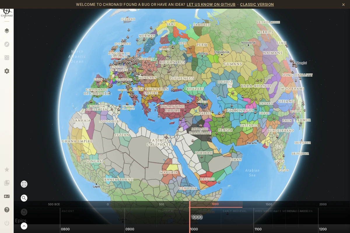
An interactive 3D globe displaying world political borders circa 1000 AD, with empires like the Byzantine Empire, Abbasid Caliphate, and Kievan Rus color-coded across continents, with a timeline scrubber at the bottom.

chronas.org

Chronas – Interactive Historical World Map

Chronas is one of those rare projects that makes you lose track of time — quite literally. It presents the entire political history of the world as a navigable 3D globe, spanning from 500 BCE all the way to the modern era. A timeline bar runs along the bottom of the screen, divided into eras from Ancient through Classical, Medieval, Renaissance, and Modern — and sliding it transforms the map in real time, redrawing borders, renaming territories, and reshuffling the colors of hundreds of polities simultaneously.\n\nAt the year 1000 AD, for instance, the map bursts with the Byzantine Empire, the Abbasid Caliphate, the Kievan Rus, the Song Dynasty, and dozens of smaller kingdoms and tribal confederacies — each rendered with its own colored region and label. The level of historical granularity is genuinely impressive, covering not just the major empires that dominate textbooks but also smaller entities like the Pechenegs, the Ghaznavids, the Srivijaya, or the Kanem-Bornu. It’s the kind of map that rewards curiosity and punishes impatience in the best possible way.\n\nThe project is open-source, with active development tracked on GitHub, and it invites community contributions for bug reports and new ideas. A “Classic Version” is also available for those who prefer the earlier interface. The community-driven nature of Chronas means its historical data continues to grow and be refined over time, making it both a tool and a living collaborative archive.\n\nFor students, history enthusiasts, game designers, or anyone who has ever wondered what the world looked like when the Vikings were raiding and the Tang Dynasty was flourishing, Chronas offers an endlessly explorable answer — rendered beautifully, at your own pace.\n\n🔗 chronas.org ...

July 18, 2026 · Cogimator Team
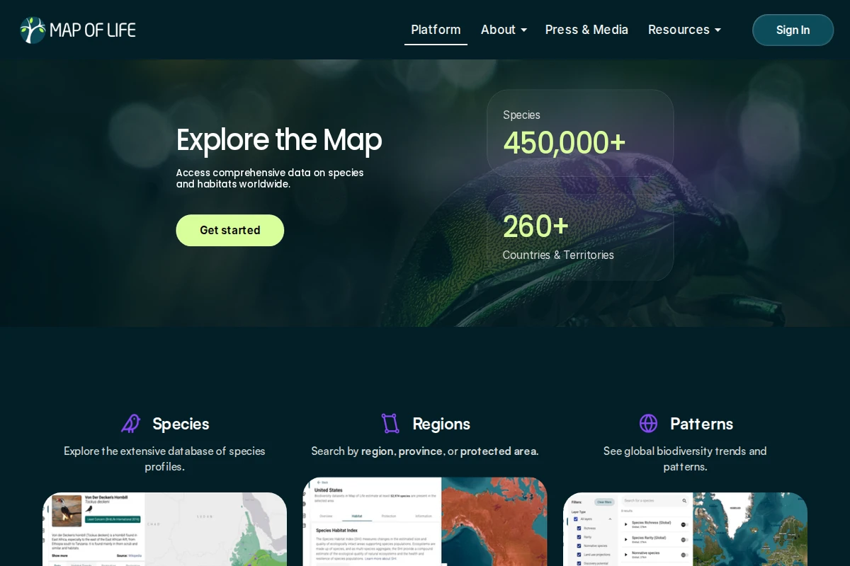
The Map of Life homepage showing a dark hero section with a chameleon close-up, species count of 450,000+, and navigation options for Species, Regions, and Patterns.

mol.org

Map of Life — Global Biodiversity Atlas

Map of Life is one of the most ambitious biodiversity data platforms on the web — a living atlas that attempts to answer a deceptively simple question: what lives where? With over 450,000 species catalogued across more than 260 countries and territories, it draws on decades of scientific research to make the distribution of life on Earth explorable by anyone with a browser.\n\nThe platform is organized around three core lenses. Through Species, users can browse detailed profiles for animals, plants, fungi, and more, each tied to geographic range data and sourced imagery. Through Regions, you can zoom into any country, province, or protected area and immediately see what species call it home, along with habitat quality metrics. The Patterns view steps back to reveal global biodiversity trends — where richness is concentrating, where it’s declining, and how ecosystems are shifting over time.\n\nWhat sets Map of Life apart from a simple species database is its role in actual conservation policy. Its Species Protection Index, Species Habitat Index, and Species Information Index have been formally adopted under the Kunming-Montreal Global Biodiversity Framework (GBF) — meaning the numbers generated here feed directly into international targets for nature protection. That’s a rare thing: a website whose outputs matter in diplomatic negotiating rooms.\n\nThe design is clean and map-centric, prioritizing exploration over information overload. Whether you’re a researcher tracking population changes, a curious naturalist wondering what beetles inhabit your province, or a policymaker needing hard indicators, Map of Life meets you where you are. It’s science made navigable — and the stakes behind it couldn’t be higher.\n\n🔗 mol.org ...

July 18, 2026 · Cogimator Team
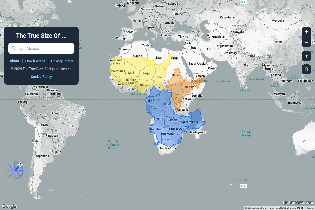
An interactive world map showing multiple African countries dragged into the same view, colour-coded to reveal their true comparative sizes under Mercator projection.

thetruesize.com

The True Size Of… — Country Size Comparator

Most of us grew up with world maps that quietly lied to us. The Mercator projection — ubiquitous in classrooms, atlases, and Google Maps alike — dramatically inflates the size of landmasses near the poles while compressing those near the equator. The result is a deeply skewed mental model of the world: Greenland looks comparable to Africa, Alaska dwarfs Brazil, and Europe seems far larger than it actually is relative to Sub-Saharan countries.\n\nThe True Size Of… exists to correct that intuition in the most direct way possible. You type in the name of any country, and a coloured silhouette of it appears on the map — one that you can then drag freely across the globe. As you move it toward the poles or back toward the equator, the shape dynamically adjusts to reflect the Mercator distortion at that latitude, letting you place countries side by side for an honest comparison. The screenshot above shows exactly this: multiple African nations stacked together, revealing that the continent dwarfs what standard maps imply.\n\nWhat makes this tool so effective is its elegant simplicity. There are no tutorials required, no data tables to parse — just drag, compare, and feel the quiet shock of realising how profoundly cartographic convention has shaped your worldview. Africa, it turns out, is large enough to swallow the contiguous United States, China, India, and most of Europe simultaneously. That’s not a fun fact — it’s a correction to a decades-long optical illusion baked into our education.\n\nBeyond the “wow” moment, the site works as a genuinely useful research and teaching tool. Geography teachers, journalists, and anyone working with spatial data will find it indispensable for building accurate mental models of scale. It supports multiple languages and runs entirely in the browser, requiring nothing beyond a curiosity about the world’s actual shape.\n\n🔗 thetruesize.com ...

July 18, 2026 · Cogimator Team
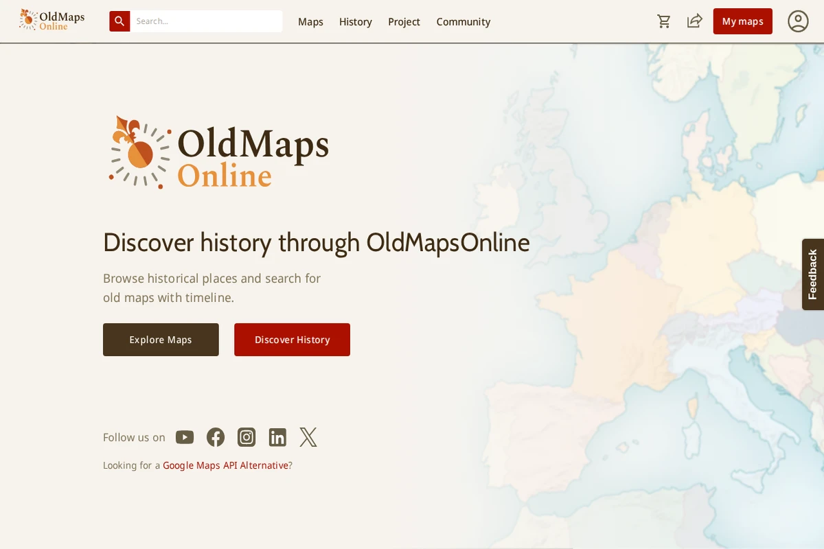
Screenshot of OldMapsOnline homepage showing historical maps of the Baltic Sea region with a timeline interface and search functionality.

oldmapsonline.org

OldMapsOnline - Historical Maps Archive and Explorer

OldMapsOnline represents one of the most ambitious efforts to digitize and catalog the world’s cartographic heritage. This remarkable platform brings together thousands of historical maps from libraries, archives, and collections worldwide, making centuries of geographical knowledge accessible through an intuitive timeline-based interface. What sets this project apart is its sophisticated search functionality that allows users to explore maps by location, time period, and scale. The platform seamlessly integrates historical cartography with modern mapping technology, enabling users to overlay old maps onto contemporary geographical references. Each map entry includes detailed metadata about publishers, dates, scales, and provenance, creating a scholarly resource that serves both researchers and curious explorers. ...

April 16, 2026 · Cogimator Team
Arcanum Maps homepage showing a historical map background with navigation menu and Europe in the XIX century heading.

maps.arcanum.com/en

Arcanum Maps - Historical European Cartography Archive

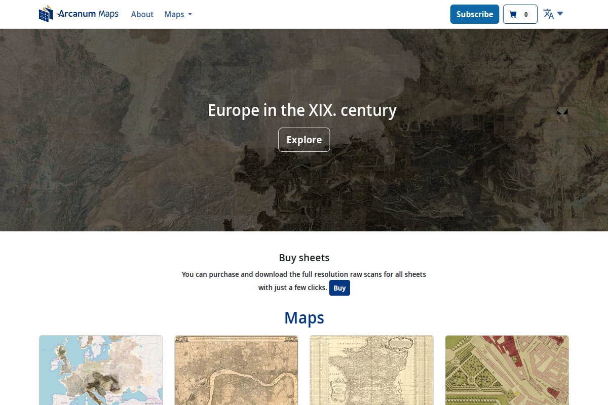
Arcanum Maps presents a meticulously curated collection of historical European cartography, with a particular emphasis on 19th-century materials. This digital archive serves as a bridge between historical scholarship and modern accessibility, offering researchers, historians, and map enthusiasts high-quality digitized versions of period maps that would otherwise remain locked away in archives and libraries. The platform’s strength lies in its comprehensive coverage of European territories during a pivotal century of political and geographical transformation. From detailed city plans to broad national surveys, the collection captures the cartographic documentation of an era when Europe was reshaping itself through industrialization, nationalism, and imperial expansion. The interface allows users to explore these historical documents with contemporary ease while maintaining scholarly rigor. ...

April 13, 2026 · Cogimator Team
Screenshot showing Electricity Maps platform with a colorful European map displaying electricity data for Germany and navigation menu.

electricitymaps.com

Electricity Maps: Real-Time Global Grid Data Platform

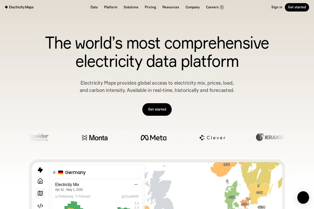
Electricity Maps stands as the world’s most comprehensive electricity data platform, offering unprecedented visibility into global power grids across more than 190 countries. This remarkable resource transforms the complex world of energy data into accessible, actionable insights that span electricity mix composition, carbon intensity measurements, real-time pricing, and grid load information. The platform’s true strength lies in its temporal comprehensiveness—users can access eight years of historical data, monitor real-time conditions, and explore forecasts up to 72 hours ahead. Whether you’re tracking renewable energy penetration in Germany, analyzing carbon emissions patterns, or monitoring electricity prices across European markets, Electricity Maps delivers standardized, harmonized data that makes cross-regional comparisons meaningful and reliable. ...

April 8, 2026 · Cogimator Team
Interactive map showing real-time aircraft positions with colorful plane icons scattered across a geographical view of cities and regions.

globe.adsbexchange.com

ADS-B Exchange - Live Aircraft Tracking Map

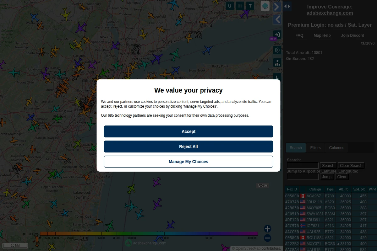
ADS-B Exchange represents one of the most comprehensive and open aircraft tracking platforms available today, offering real-time visibility into global aviation activity. Unlike commercial flight tracking services, this community-driven project provides unfiltered access to aircraft data, showing everything from commercial airliners to private jets, military aircraft, and emergency services. The platform displays live aircraft positions using Automatic Dependent Surveillance-Broadcast (ADS-B) technology, where aircraft continuously transmit their GPS coordinates, altitude, speed, and identification data. The interface presents this information through an interactive map populated with colorful aircraft icons, each representing a real flight in progress. Users can access detailed flight information including hex codes, callsigns, aircraft types, altitudes, and ground speeds for thousands of simultaneous flights. ...

April 4, 2026 · Cogimator Team
Global Fishing Watch homepage showing satellite ocean imagery with vessel tracking data and navigation menu for ocean monitoring tools.

globalfishingwatch.org

Global Fishing Watch: Ocean Transparency Through Technology

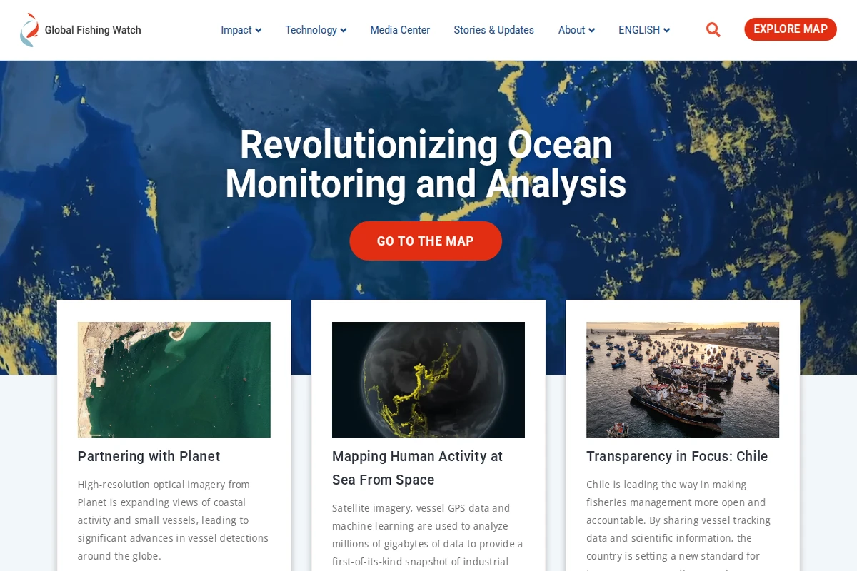
Global Fishing Watch represents a groundbreaking fusion of satellite technology, artificial intelligence, and marine conservation that’s transforming how we understand human activity at sea. This remarkable platform processes millions of gigabytes of data to create the world’s first comprehensive, real-time map of industrial fishing activity across our planet’s oceans. Founded through a collaboration between Oceana, SkyTruth, and Google, the platform harnesses cutting-edge technology including high-resolution optical imagery from Planet satellites, vessel GPS tracking data, and sophisticated machine learning algorithms. The result is an unprecedented level of transparency that enables researchers, policymakers, and the public to monitor fishing vessels, detect illegal activities, and understand patterns of ocean use like never before. ...

April 4, 2026 · Cogimator Team
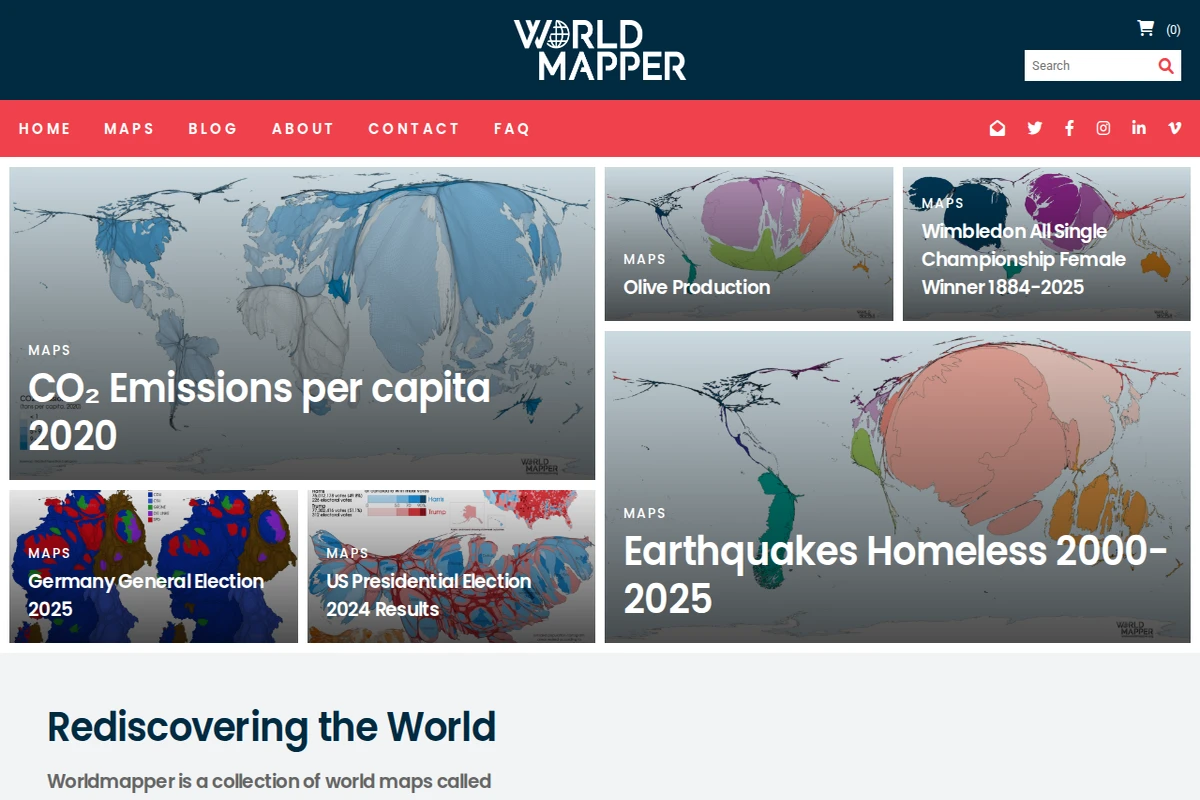
Screenshot showing various world map cartograms including CO₂ emissions, olive production, and earthquake data with distorted country sizes.

worldmapper.org

Worldmapper - Data Visualization Through Cartograms

Worldmapper presents a fascinating alternative to conventional cartography by creating cartograms where countries and territories are resized according to specific data points rather than geographical area. This ingenious approach reveals patterns and relationships in global data that traditional maps often obscure. The platform offers an extensive collection of maps covering diverse topics from environmental data like CO₂ emissions per capita to cultural phenomena such as Wimbledon championship winners by country. Each cartogram transforms our familiar world map into something both alien and illuminating — countries might appear as tiny slivers or massive blobs depending on their relationship to the measured variable. ...

April 3, 2026 · Cogimator Team
Screenshot showing MapCrunch interface with a privacy consent dialog overlaying a blurred Street View background of a mountainous landscape.

mapcrunch.com

MapCrunch - Random Google Street View Explorer

MapCrunch offers one of the purest forms of digital wanderlust — a single click that can transport you from your desk to a remote road in Hawaii, a bustling street in Tokyo, or a quiet village in Estonia. This elegantly simple tool harnesses Google Street View’s vast photographic database to create serendipitous virtual journeys around the globe. The interface couldn’t be more straightforward: hit the “Go!” button and find yourself somewhere completely unexpected. You can filter by continent or country if you prefer some geographical boundaries to your exploration, or choose specialized modes like “Urban,” “Indoor,” or “Stealth” for different flavors of discovery. The site also features a “View of the Day” and user-submitted gallery of particularly striking locations. ...

March 27, 2026 · Cogimator Team