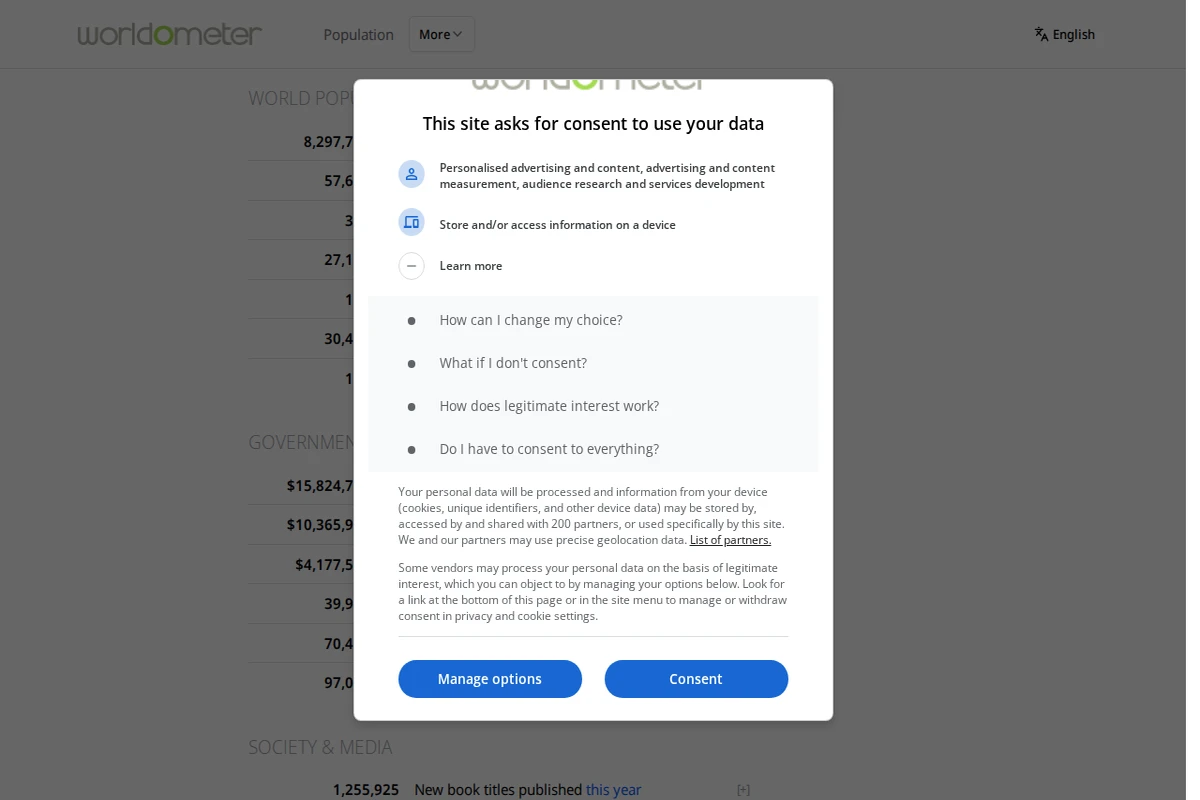
The Future Timeline website homepage showing a blue space-themed design with navigation options for different centuries and time periods.

futuretimeline.net

Future Timeline - Interactive Predictions Through the Centuries

Future Timeline presents one of the most comprehensive attempts to map humanity’s long-term future, stretching from our current century through to cosmic scales of time. This remarkable resource organizes predictions and speculations across multiple disciplines, from climate science and artificial intelligence to space colonization and the ultimate fate of consciousness itself. The site’s structure is elegantly chronological, beginning with the challenges of our globalized 21st century—climate change, resource depletion, and technological upheaval—before expanding into increasingly speculative territory. The 22nd century explores diverging paths for humans and transhumans, while the far future contemplates post-biological humanity spreading throughout the galaxy. What sets this project apart is its serious engagement with both near-term scientific consensus and far-future theoretical possibilities. ...

April 16, 2026 · Cogimator Team
Screenshot showing Resource Watch homepage with an Earth view from space and the tagline 'Monitoring the Planet's Pulse'.

resourcewatch.org

Resource Watch - Global Environmental Data Platform

Resource Watch stands as one of the most comprehensive environmental data platforms available today, offering a remarkable window into our planet’s vital signs. Developed by the World Resources Institute, this ambitious project aggregates trusted datasets from around the globe to help researchers, policymakers, and citizens understand the complex environmental challenges facing humanity. The platform excels in making vast amounts of environmental data accessible through intuitive visualizations and interactive dashboards. Users can explore everything from deforestation patterns and ocean health indicators to urban air quality and climate data. The site features specialized collections covering eight major themes: Energy, Forests, Ocean Watch, Food, Society, Climate, Cities, and Water. Each dashboard presents curated data stories that reveal patterns and connections across different environmental systems. ...

April 8, 2026 · Cogimator Team
The OEC website homepage showing a colorful world map visualization and sections for exploring global trade data and economic complexity.

oec.world

OEC - Observatory of Economic Complexity

The Observatory of Economic Complexity (OEC) stands as one of the most comprehensive global trade intelligence platforms available today. This remarkable resource transforms complex economic data into accessible visualizations, covering over 5,000 products, 5,700 subnational regions, and detailed trade relationships between 190+ countries. The platform’s strength lies in its ability to decode intricate global trade patterns and present them through intuitive maps, networks, and interactive charts. What sets the OEC apart is its focus on Economic Complexity — a sophisticated metric that measures the knowledge and capabilities embedded in a country’s productive structure. Users can explore how nations develop comparative advantages, predict export opportunities, and understand the evolutionary pathways of economic development. The platform offers powerful analytical tools including tariff simulators, growth predictions, and export potential assessments that help researchers, policymakers, and businesses make data-driven decisions. ...

April 4, 2026 · Cogimator Team
Website homepage of DensityDesign Lab showing their logo and various data visualization projects including climate data and security visualizations.

densitydesign.org

DensityDesign Lab: Data Visualization Research

DensityDesign represents one of the most compelling intersections of design thinking and data science in contemporary academic research. Based at Milan’s prestigious Politecnico di Milano, this research lab has carved out a distinctive niche by approaching information visualization not merely as a technical challenge, but as a profound design problem that requires careful consideration of how we communicate complex social and cultural phenomena. The lab’s work spans an impressive range of applications, from cyber-security visualization for water distribution systems to climate data representation and social media research methodologies. What sets DensityDesign apart is their commitment to tackling real-world problems through the lens of visual communication design. Their projects demonstrate how thoughtful visualization can make abstract data tangible and accessible, whether they’re mapping informal transport networks or exploring the cultural implications of contraceptive use through poster design. ...

April 3, 2026 · Cogimator Team
Screenshot of PKP's homepage showing their mission to make research a global public good with open source publishing platforms.

pkp.sfu.ca

Public Knowledge Project - Open Source Academic Publishing

The Public Knowledge Project represents one of the most significant contributions to democratizing scholarly publishing in the digital age. This research and development initiative from Simon Fraser University has created an entire ecosystem of open source publishing platforms that power over 50,000 journals worldwide, making it a cornerstone of the global open access movement. At the heart of PKP’s offerings are three powerful platforms: Open Journal Systems (OJS), the world’s most widely used journal management software; Open Monograph Press (OMP) for book publishing; and Open Preprint Systems (OPS) for preprint servers. What sets PKP apart is not just the robustness of their free software, but their comprehensive approach that includes hosting services, training, and ongoing research into scholarly communication practices. ...

March 27, 2026 · Cogimator Team
Screenshot of Harvard's Atlas of Economic Complexity homepage showing a globe visualization and sections for trade dynamics and country profiles.

atlas.hks.harvard.edu

Atlas of Economic Complexity - Harvard Growth Lab

The Atlas of Economic Complexity represents one of the most sophisticated attempts to map and understand the intricate web of global economic relationships. Developed by Harvard’s Growth Lab, this remarkable platform transforms decades of trade data into compelling visual narratives that reveal how countries develop their productive capabilities over time. At its core, the Atlas employs the concept of economic complexity — the idea that a country’s economic sophistication can be measured by the diversity and uniqueness of its exports. Through stunning interactive visualizations, users can explore trade dynamics, country profiles, and growth projections that span more than half a century. The platform’s product space visualizations are particularly striking, showing how different products cluster together based on the capabilities required to produce them. ...

March 26, 2026 · Cogimator Team
Screenshot of Connected Papers homepage showing a search interface for building visual graphs of academic paper connections.

connectedpapers.com

Connected Papers - Visual Research Graph Explorer

Connected Papers transforms the often overwhelming landscape of academic research into intuitive visual networks that reveal the hidden connections between scholarly works. By entering a paper identifier—whether DOI, arXiv URL, or title—researchers can generate interactive graphs that map citation relationships and thematic similarities across their field of interest. The platform excels at making complex academic relationships tangible through its graph-based visualization. Each node represents a paper, while connections illustrate citation patterns, co-citations, and bibliographic coupling. This approach proves invaluable for newcomers trying to understand an unfamiliar field, seasoned researchers ensuring they haven’t missed crucial works, or graduate students building comprehensive bibliographies for their theses. ...

March 24, 2026 · Cogimator Team
Screenshot of Gapminder's homepage showing the UN Sustainable Development Goals wheel and a course introduction.

gapminder.org

Gapminder - Fighting Global Misconceptions with Data

Gapminder represents one of the most compelling efforts to combat ignorance about global trends through data-driven education. This Swedish non-profit foundation, co-founded by the late Hans Rosling, has made it their mission to fight what they call “devastating misconceptions” about everything from extreme poverty and migration to climate change and global health. What sets Gapminder apart is their methodical approach to identifying and correcting these misconceptions. They systematically survey thousands of people across different countries, asking fact-based questions about global trends, then compare the responses to actual UN and other reliable data sources. The results are consistently sobering — people are wrong about nearly everything, often dramatically so. Their Worldview Upgrader tool transforms this research into an engaging quiz that reveals just how skewed our perceptions of reality can be. ...

March 24, 2026 · Cogimator Team
Screenshot of Our World in Data homepage showing global data visualization charts and research articles about world problems.

ourworldindata.org

Our World in Data: Global Progress Through Research & Charts

Our World in Data stands as one of the web’s most ambitious and valuable resources for understanding global trends and human progress. Created by researchers at the University of Oxford, this non-profit platform transforms complex statistics into accessible, interactive visualizations that help us grasp the scale of world’s biggest challenges and how they’re changing over time. The site houses over 13,900 charts covering everything from poverty and disease to education and climate change, alongside 126 comprehensive topic pages that provide deep dives into specific issues. What sets Our World in Data apart is its commitment to making data both beautiful and meaningful — each chart tells a story about human development, often revealing surprising trends like how Argentina was once richer than Spain or how literacy rates have shifted between regions. ...

March 24, 2026 · Cogimator Team
A Cloudflare security verification page for worldpopulationhistory.org showing the site is performing bot protection checks.

worldpopulationhistory.org

World Population History - Historical Demographics Database

World Population History represents a fascinating digital archive dedicated to tracking humanity’s demographic evolution across millennia. This specialized resource compiles historical population data from around the globe, offering researchers, students, and curious minds access to comprehensive statistics that illuminate how human populations have grown, migrated, and changed over time. The site serves as an invaluable tool for understanding the broader patterns of human civilization, from ancient settlements to modern urbanization. By presenting population data in accessible formats, it bridges the gap between academic research and public interest in demographic history. The database covers various geographical regions and time periods, making it possible to trace population trends across continents and centuries. ...

March 24, 2026 · Cogimator Team